
Color Pairings I Return to Again and Again
Five Color Pairings
Most of my collections start with nature - a flower, a butterfly, nature I see as I walk.
But over time I've noticed that I return to certain color pairings again and again.
They feel calm, optimistic, and easy for the home.
Whether you're designing a pattern collection or decorating a room, these combinations have a way of feeling fresh year after year.
Here are five combinations that continue to inspire my work.
Morning Garden
Sage + butter Yellow

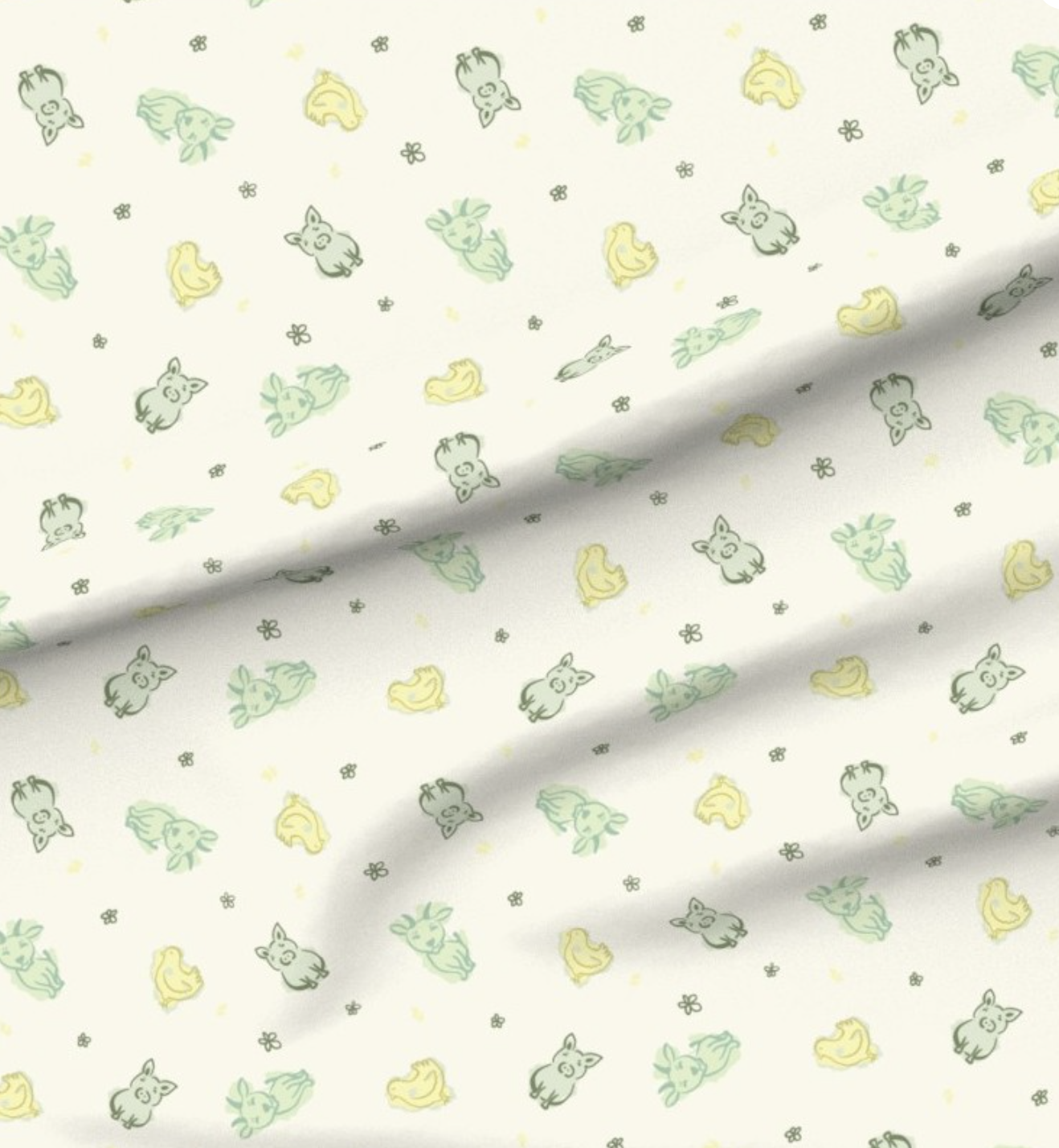
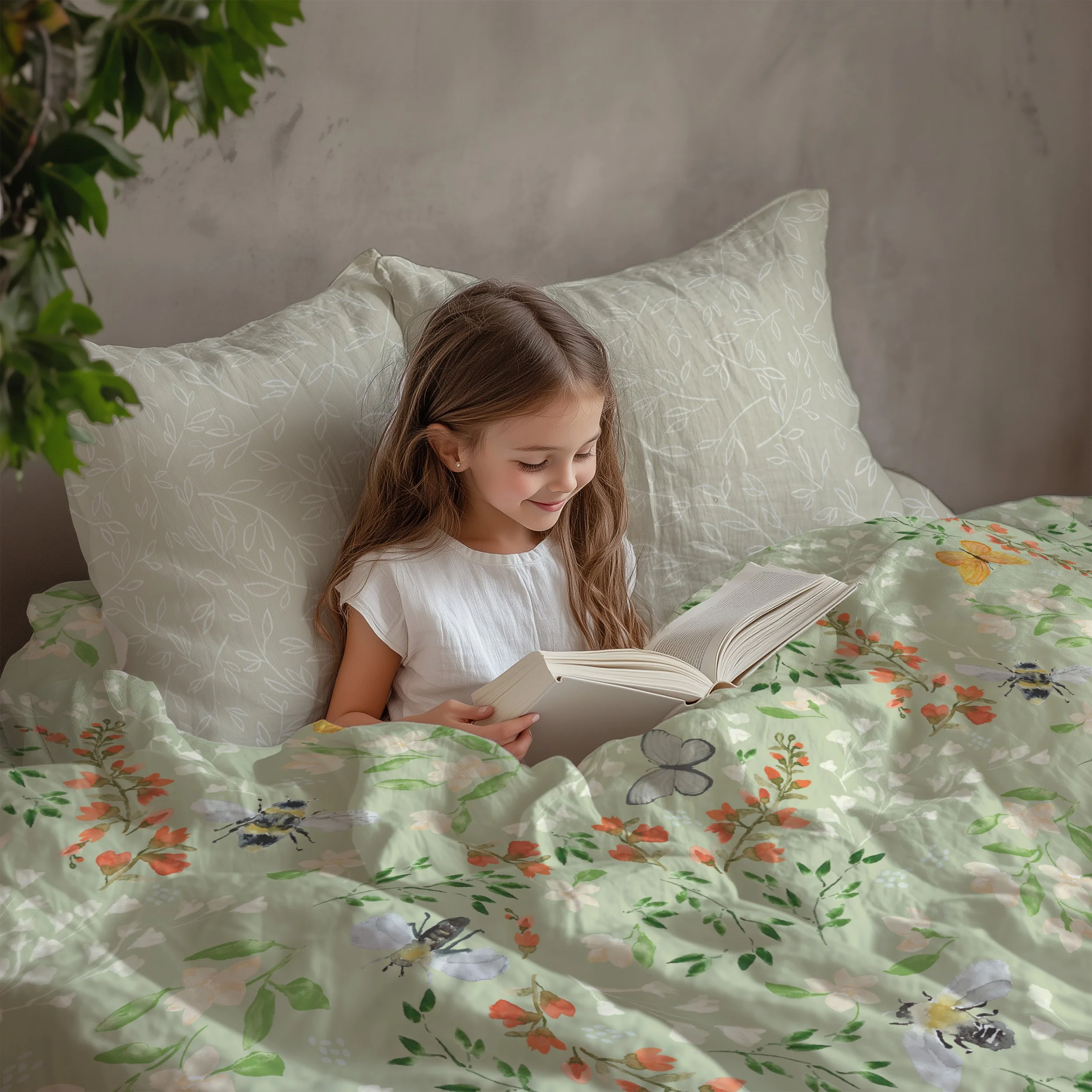
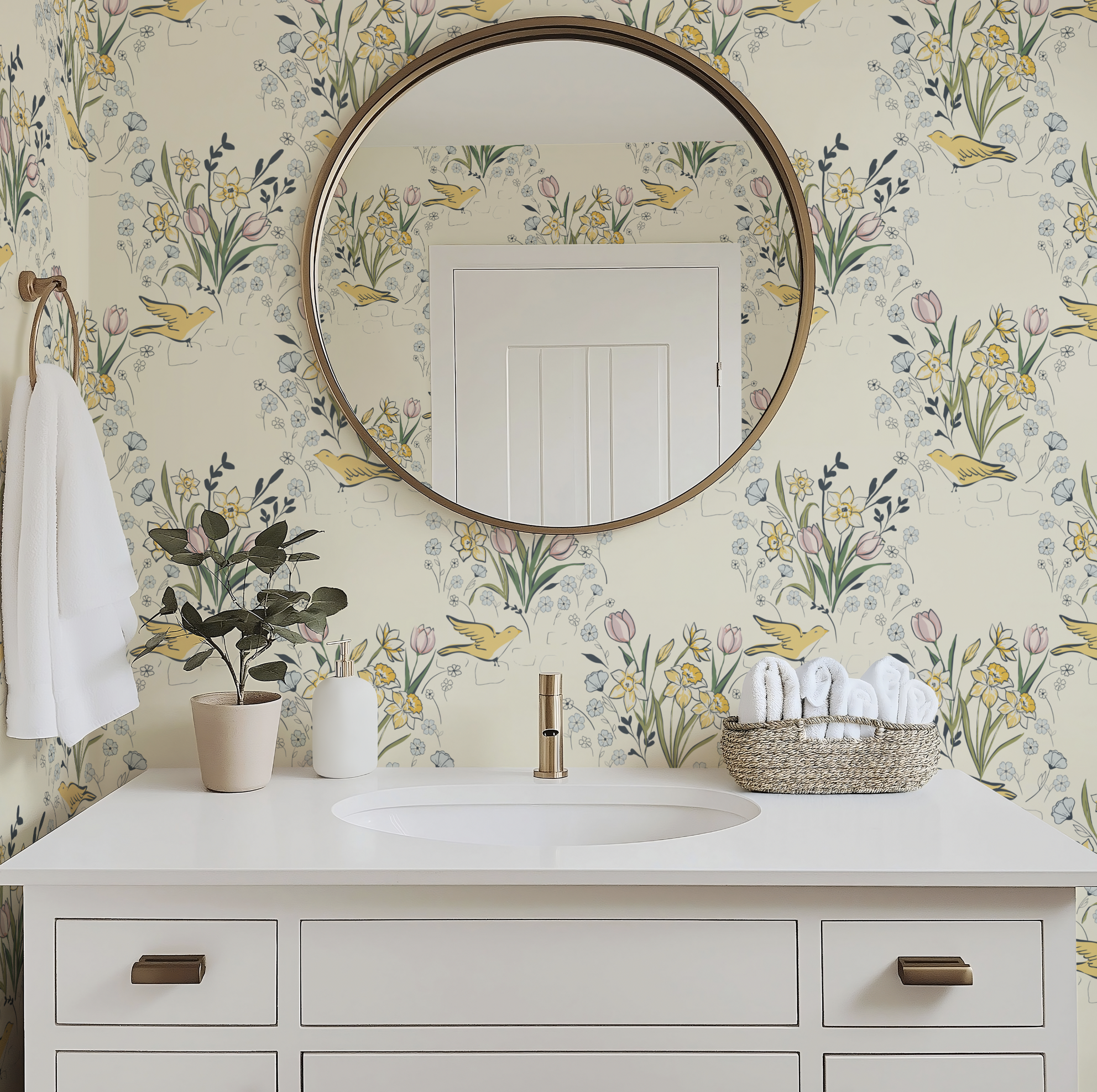
Sage greens and yellows remind us of the first warm morning when you realize spring has finally arrived.
Designer Note: I like to let the sage carry most of the visual weight while the yellow appears only in small moments. That keeps the palette feeling sophisticated instead of overly sweet.
Cottage Garden
Blush + Warm Gray

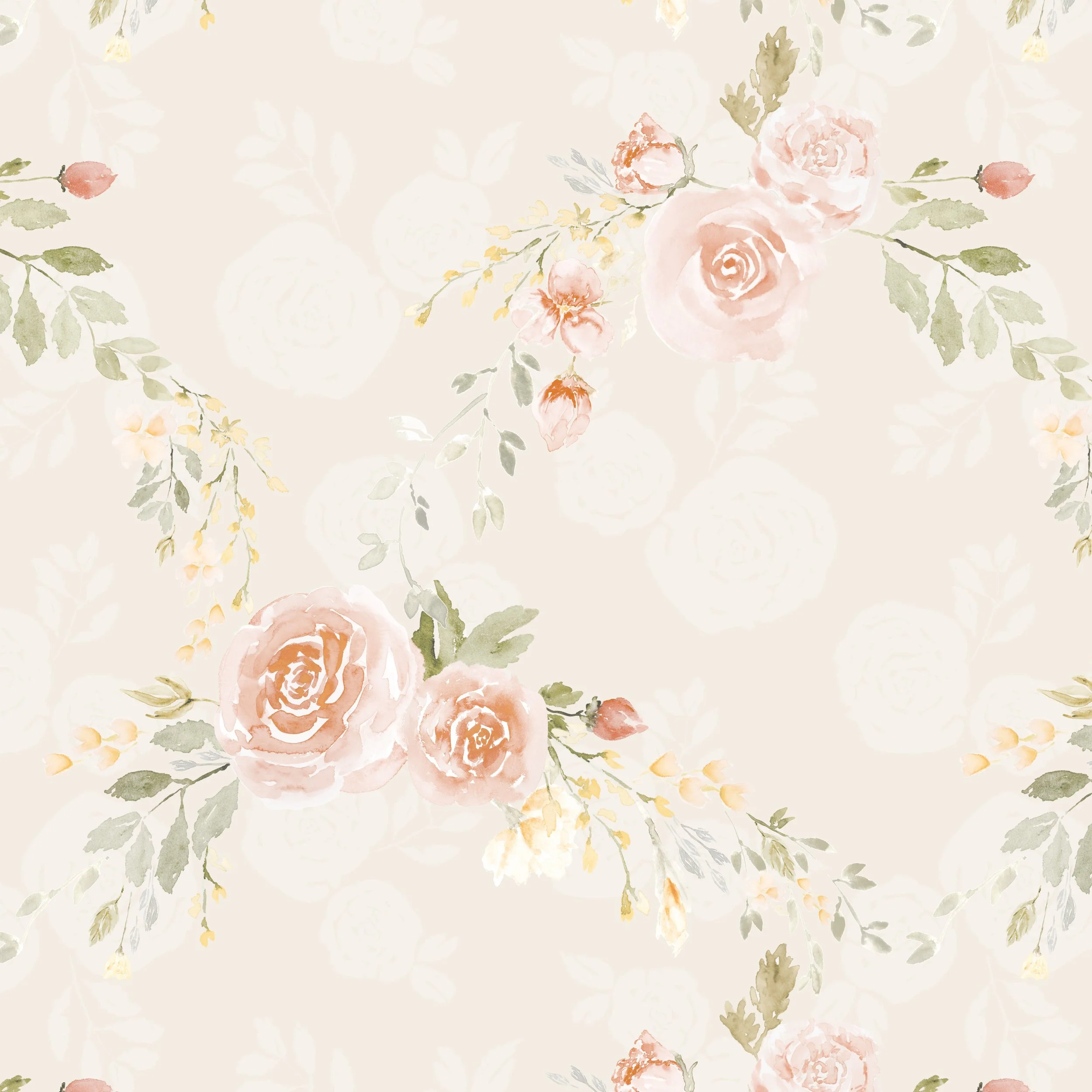
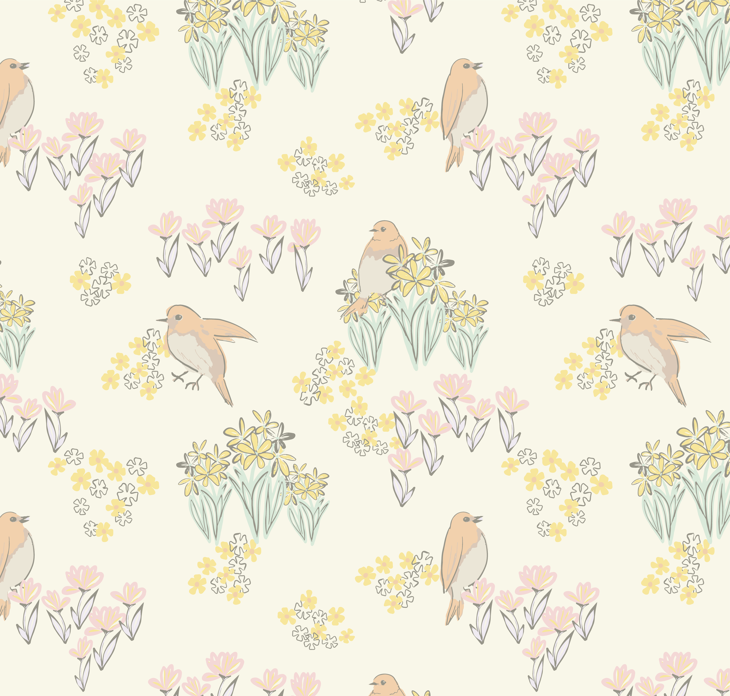
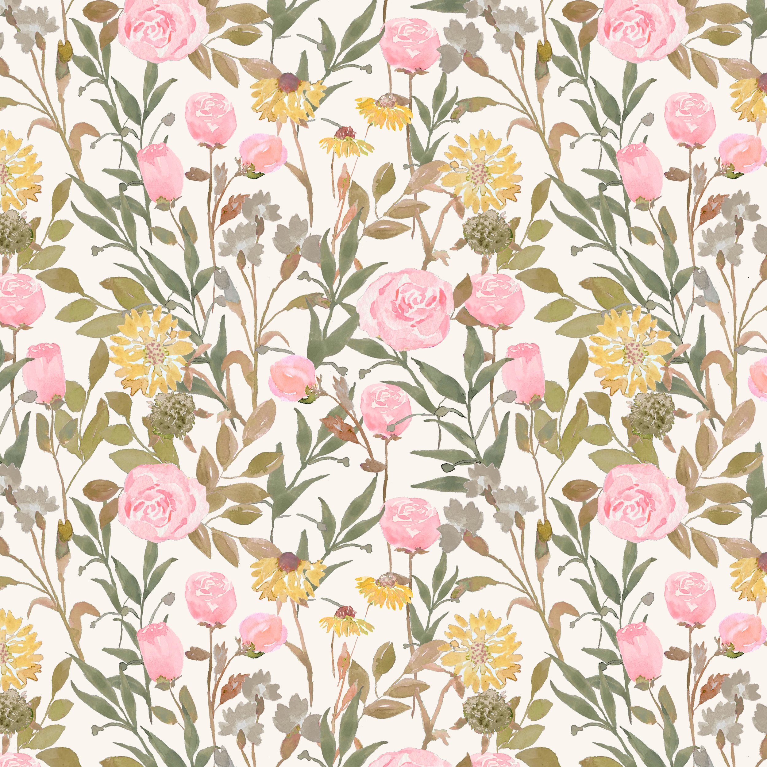
Blush pinks and warm grays speak of romance and softness.
Designer Note: Blush becomes much more versatile when paired with a warm gray instead of a cool one. The gray quietly grounds the palette while allowing the flowers to remain soft and romantic rather than overly feminine. It also adapts beautifully to both painted wood and natural oak interiors.
Summer Sky
Denim + Chambray

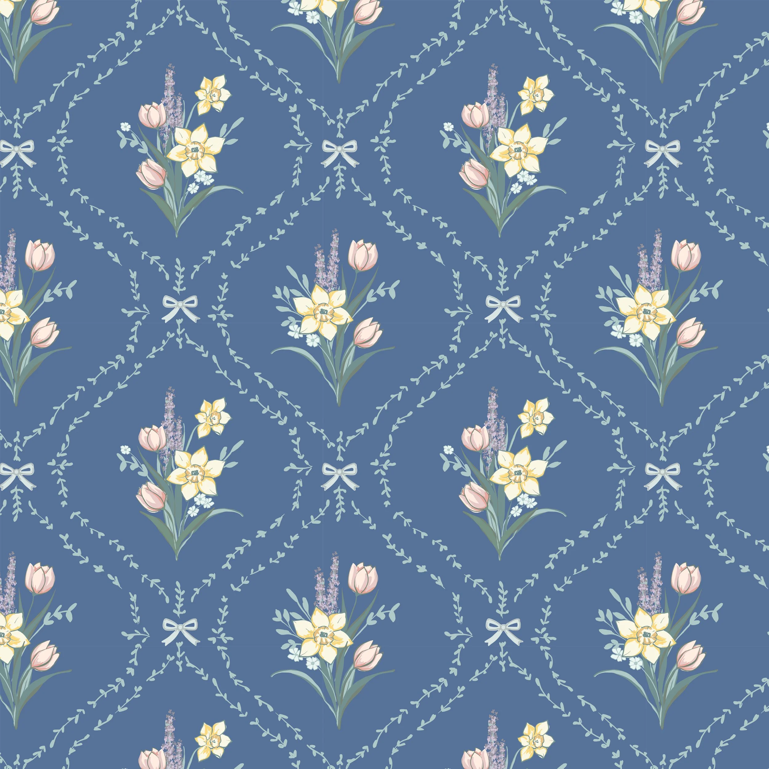
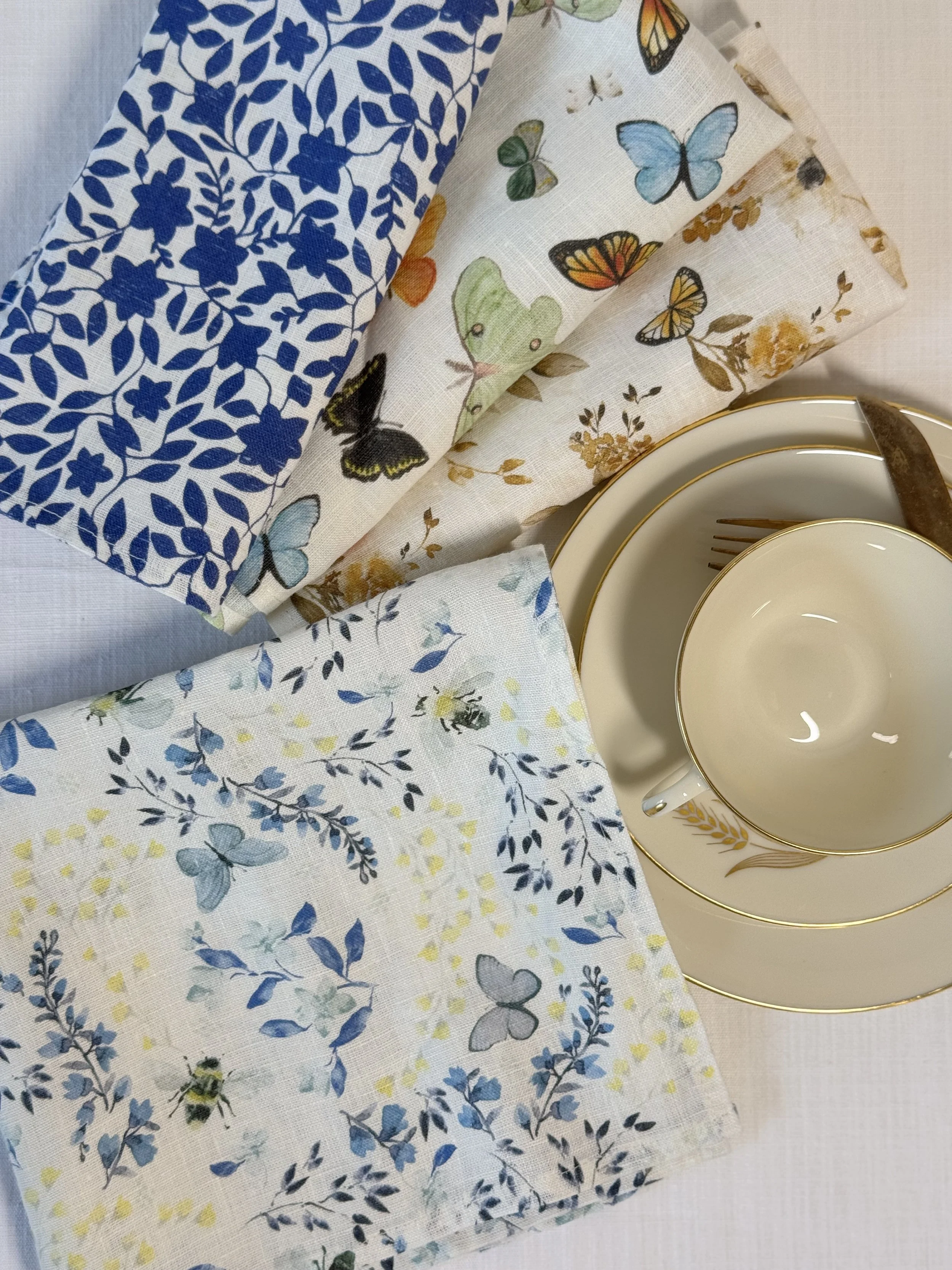
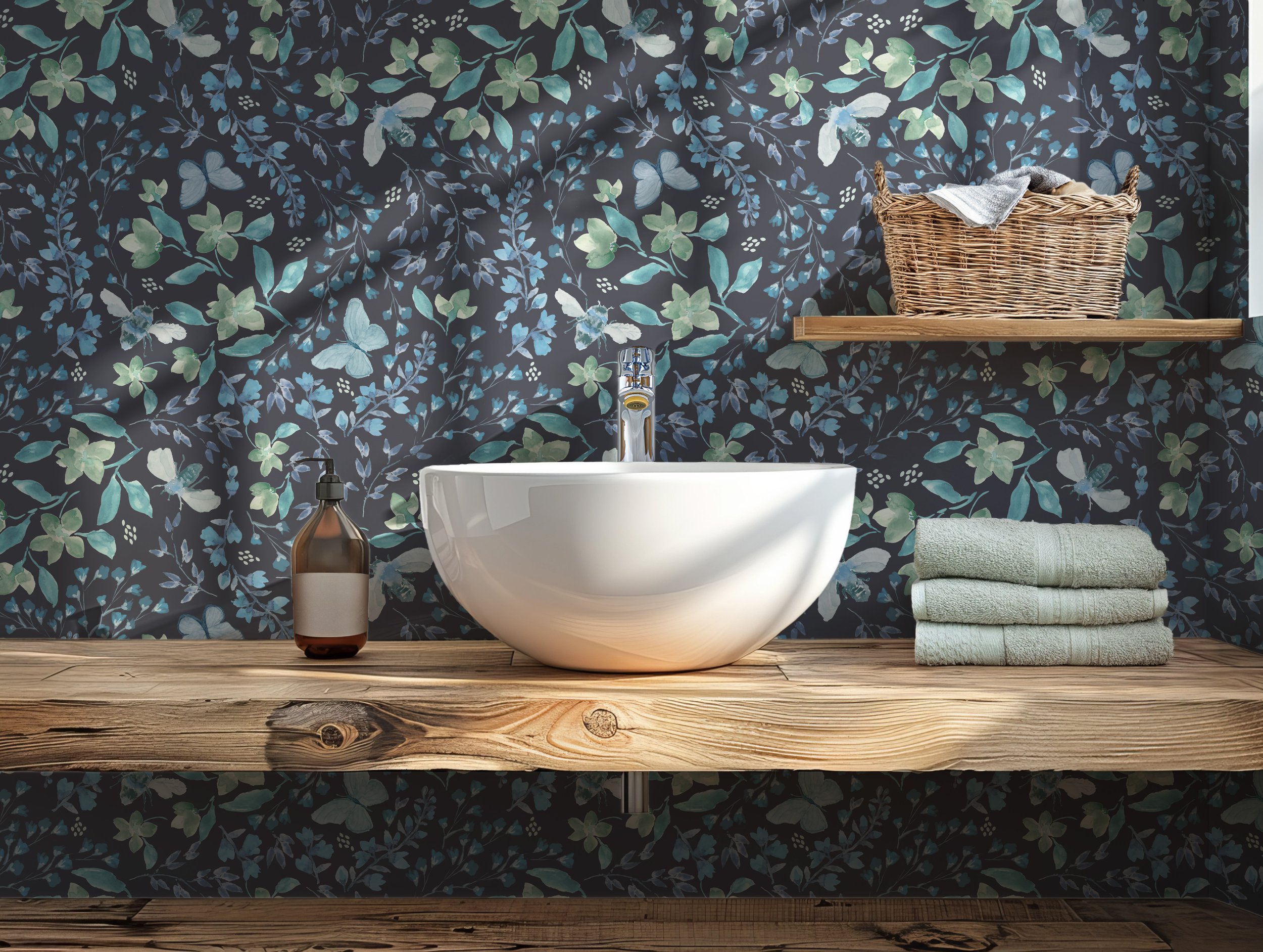
Blue skies, washed linen, open windows. Like a favorite chambray shirt, blues in a room feel comfortable and familiar.
Designer Note: Instead of treating both blues equally, I usually let the darker blue become the anchor while the lighter chambray provides lightness and movement. The result feels classic rather than nautical, making it easy to live with year-round.
Wildflower Meadow
Fuschia + Olive

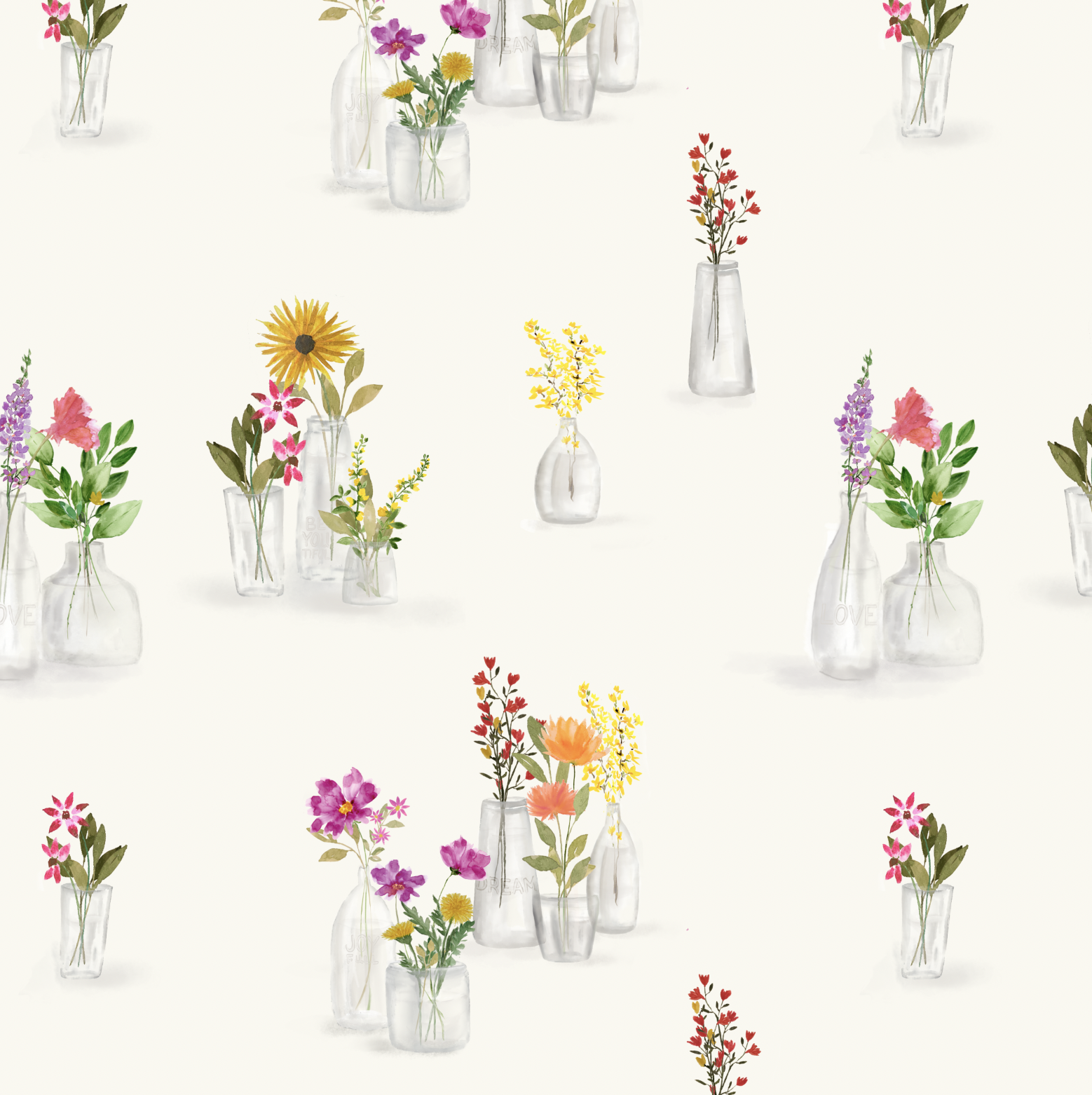
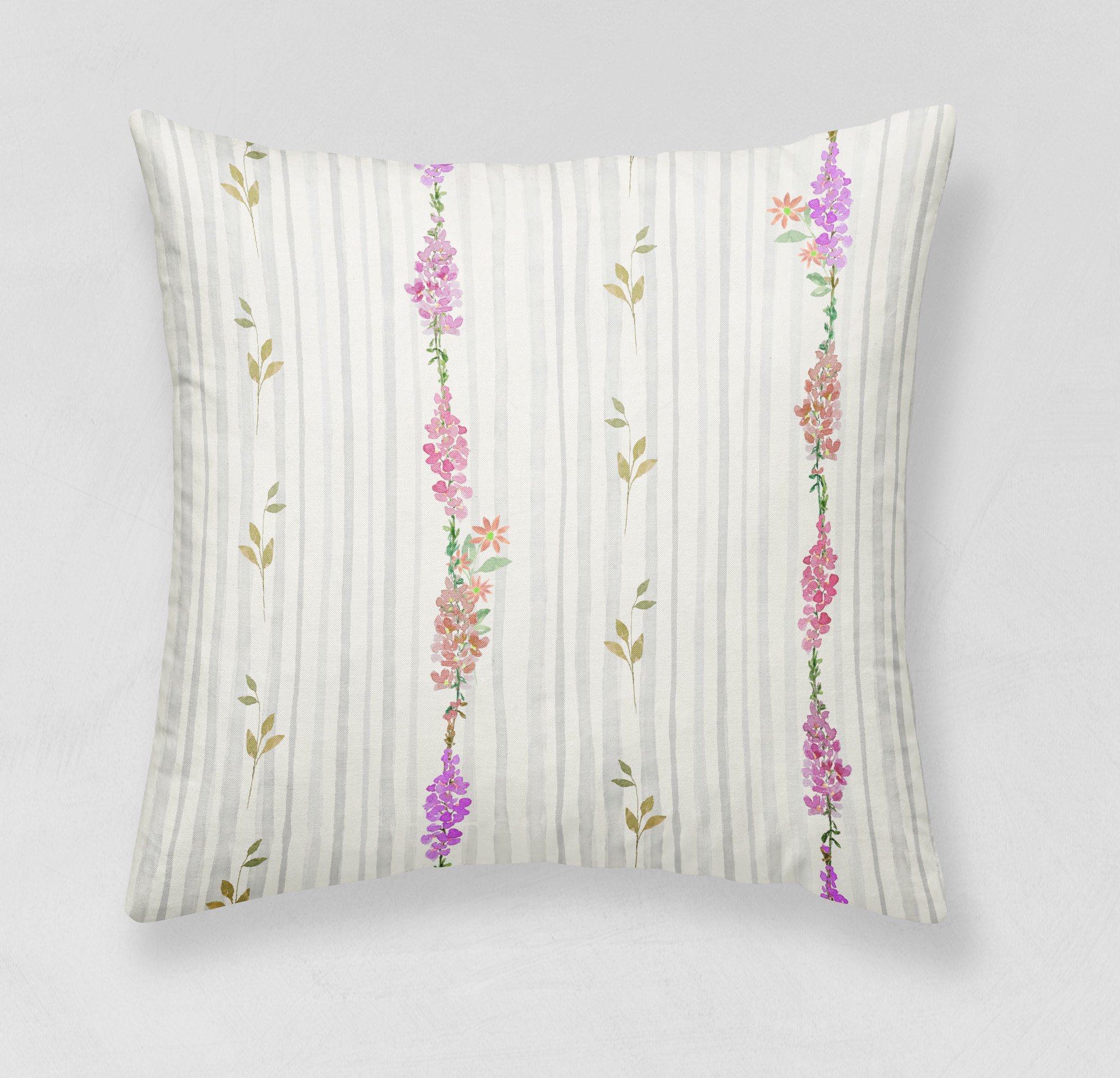
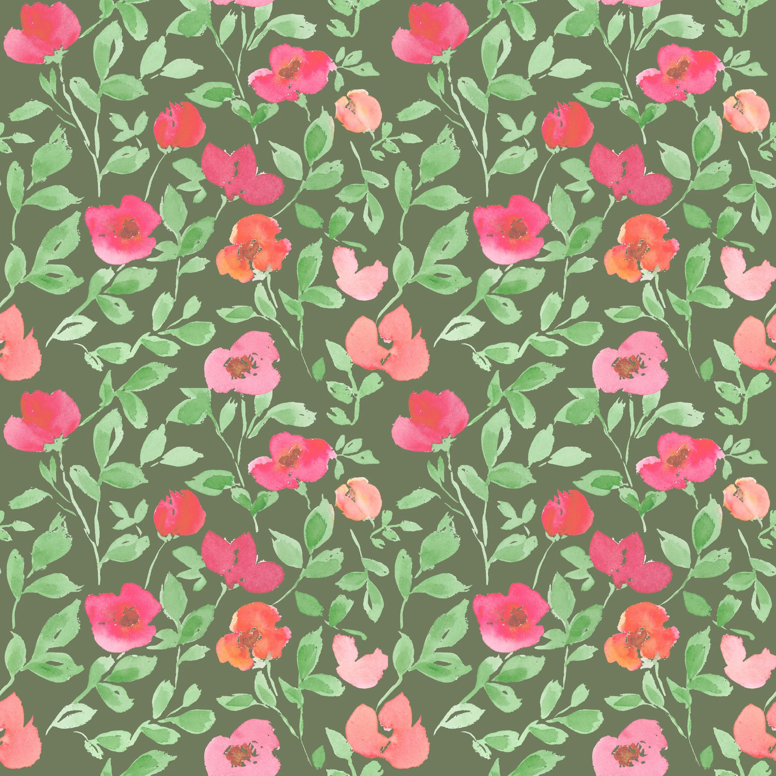
Bright blooms scattered through fresh green grasses.
Designer Note: Whenever I introduce a brighter flower color, I soften the surrounding greens. Keeping the olive slightly muted allows the floral accents to feel lively without overwhelming the eye. This pairing brings energy while still feeling rooted in nature.
Meadow Mist
Patina + Ochre

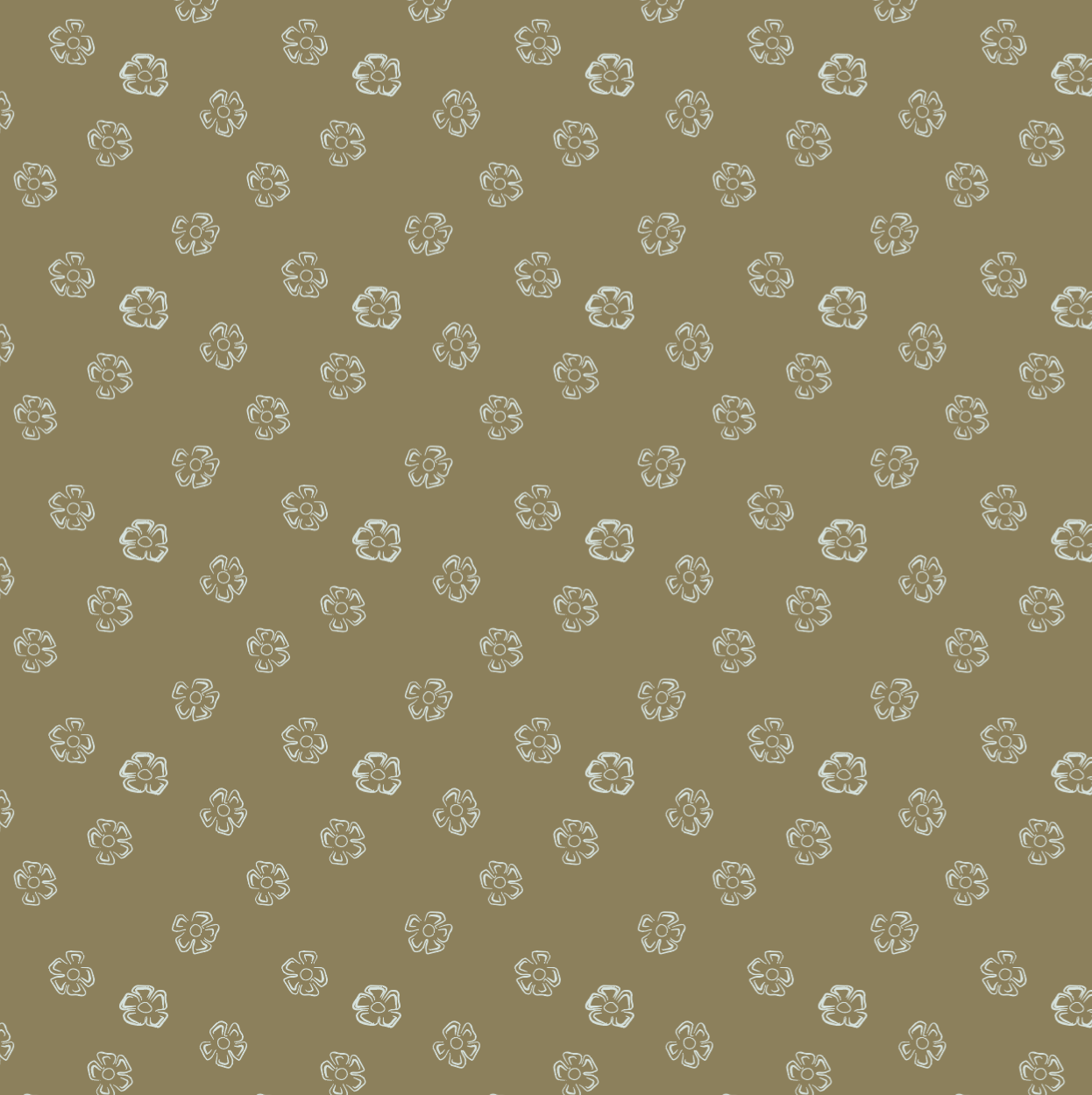
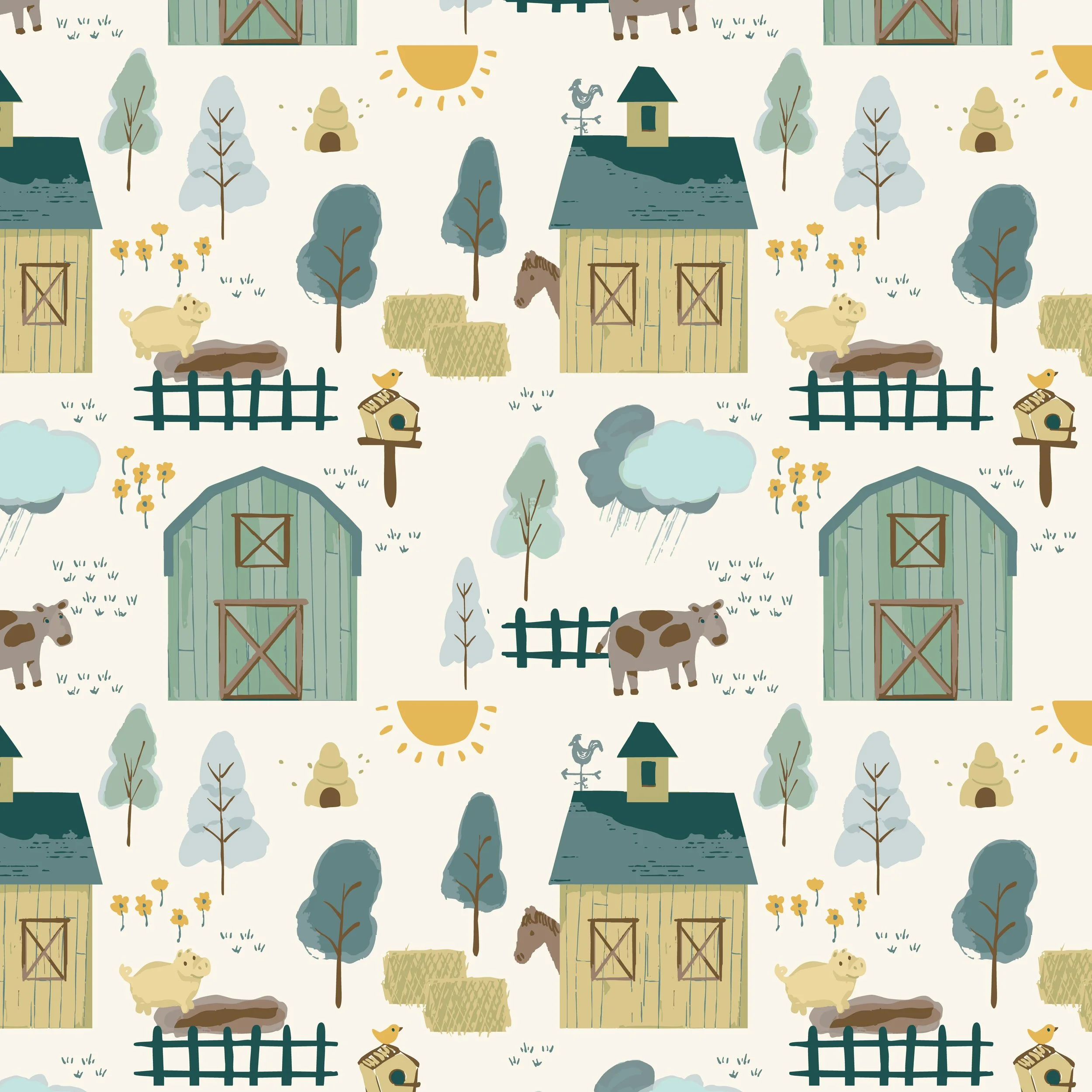
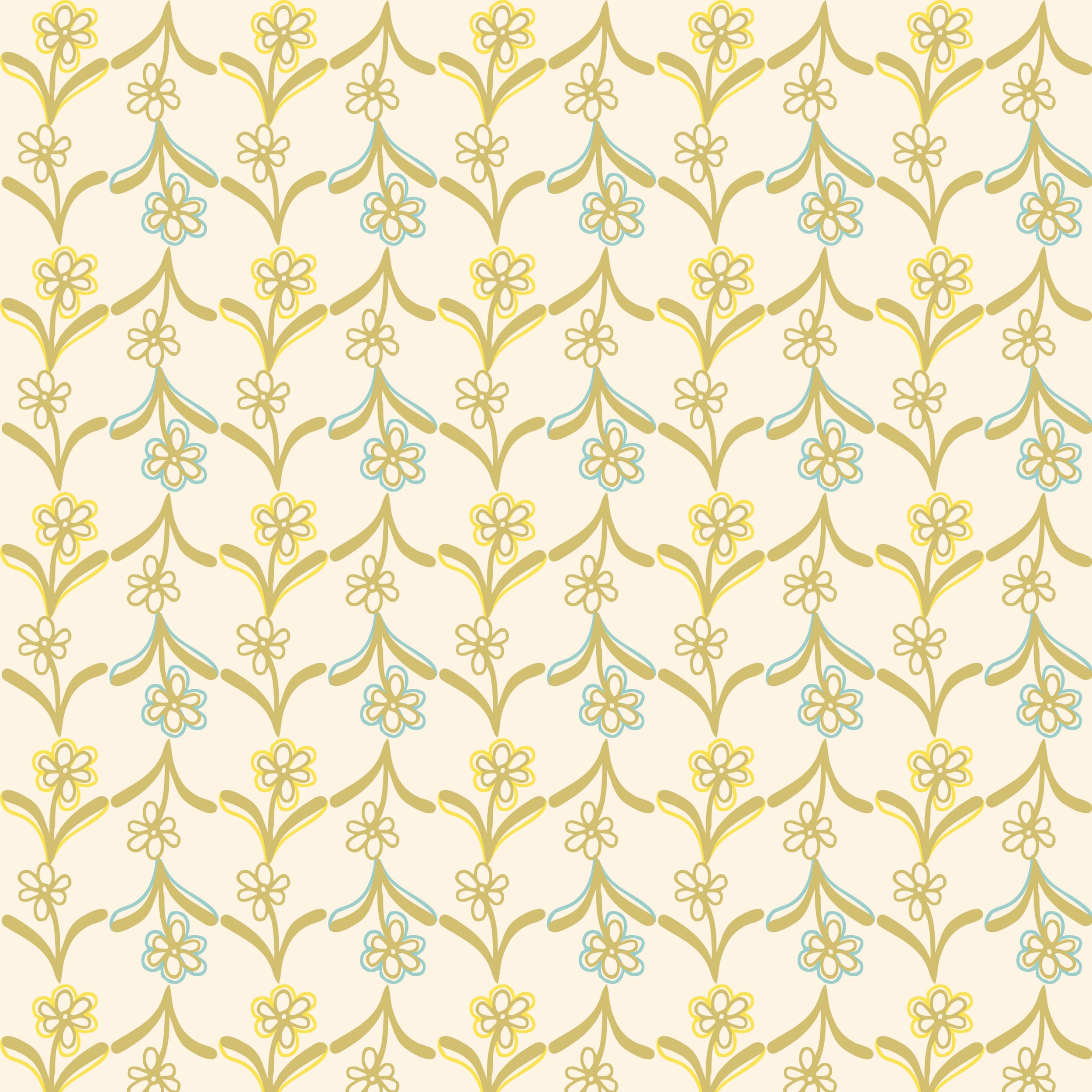
Lifting fog over fields warmed by the first sunlight.
Designer Note: Patina blue-greens naturally feel calm, while ochre introduces an earthy warmth. I often use this combination for children's collections because it feels playful yet sophisticated enough to grow with the room.
I combine my favorite color pairings beautifully with cream, linen, clotted cream, or parchment tones for accents and backgrounds. Pure white #ffffff is too harsh for textiles and wallpaper.
Looking back through my portfolio reminded me that I don't really chase color trends.
Instead, I seem to return to combinations that remind me of places, seasons, and moments in nature.
Maybe that's why they continue to feel fresh regardless of the subject matter. Nature has an incredible way of solving color problems we didn't even know we had.