
Webster Green: Pairing Benjamin Moore's 2027 Color of the Year With Wallpaper
Four ways to work with Webster Green.
Benjamin Moore recently announced Webster Green HC-130 as its 2027 Color of the Year. It's a rich, earthy green that feels both optimistic and wonderfully connected to nature.
Since green finds its way into so many of my watercolor patterns, I was curious to see how this deeper shade might work with some of my existing wallpaper designs.
Here are four combinations that offer different ways to bring Webster Green into a room, from quiet and understated to colorful and cheerful.
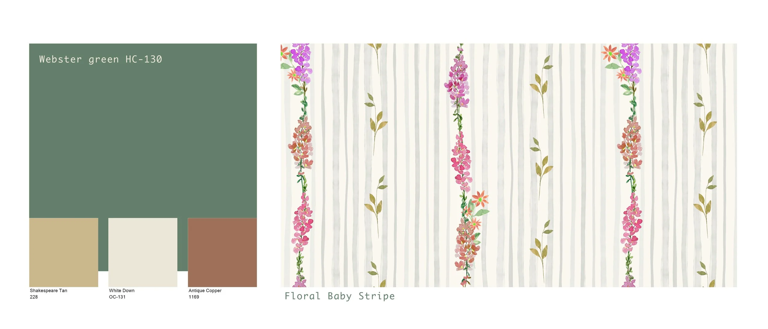
1. Webster Green + airy botanicals
Pairing a deep green with an airy botanical creates a lovely balance between richness and lightness.. I'd explore the green on cabinetry or painted trim, with the wallpaper providing a softer, more open background.
Best application: Laundry room or cottage-inspired bedroom.
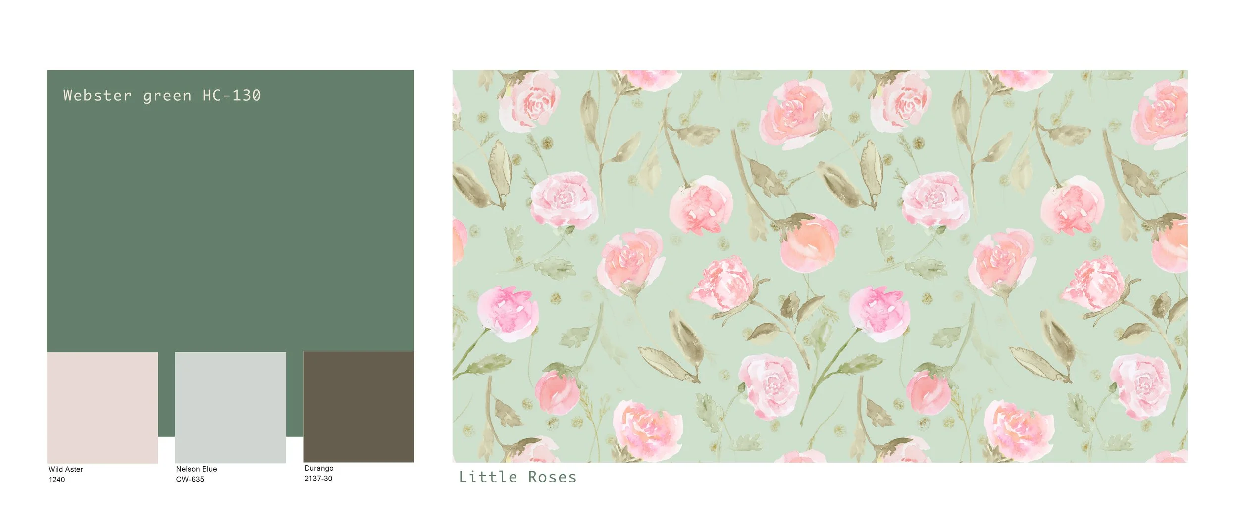
2. Webster Green + romantic florals
This is one of my favorite directions. A rich green painted vanity, door, or wainscoting with an uplifting floral gives a sophisticated, collected feeling.
Best application: Powder room or bedroom.
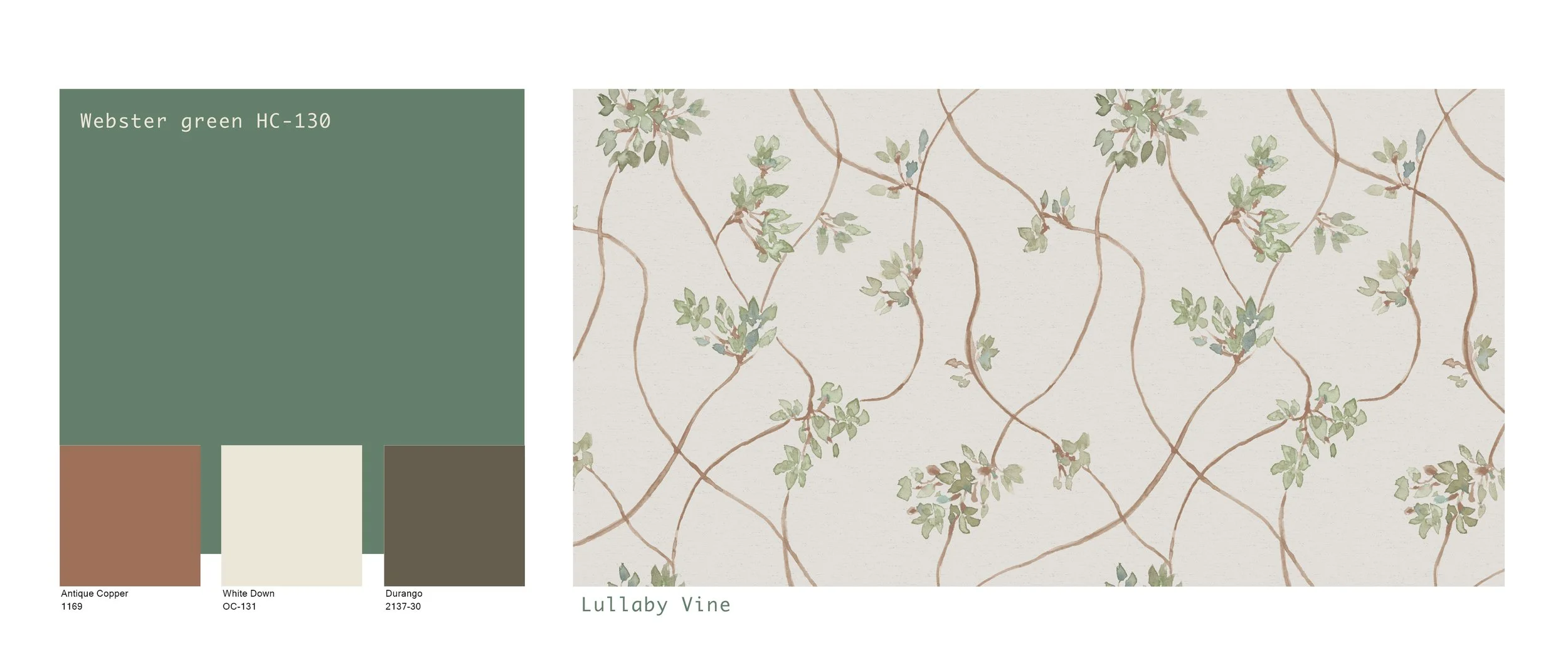
3. Webster Green + soft sage
This could make an excellent tonal story. Rather than using identical greens, combine a deeper painted surface with the softer sage botanical and warm natural materials.
Best application: Guest bathroom or garden-inspired sitting room.
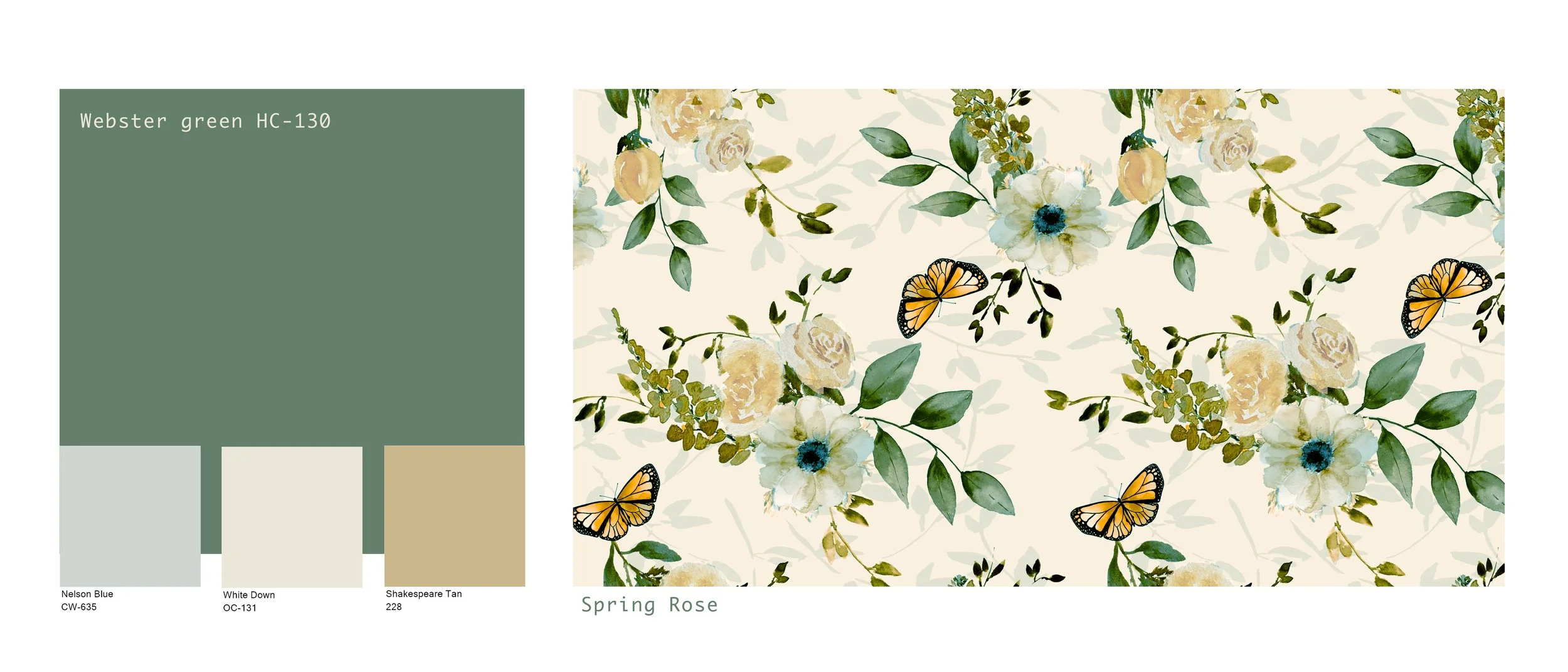
4. Webster Green + a colorful garden floral
A multicolored botanical can be a wonderful way to bring several coordinating colors into a room. The soft creams, buttery yellows, and gentle blues of Spring Rose balance the depth of Webster Green, while the leafy greens create a natural connection. The result feels fresh, welcoming, and full of life.
Best application: Sunroom, breakfast nook, or cheerful guest bedroom.
Perhaps it’s inevitable that green has always been one of my favorite colors to work with since so much of my inspiration comes from gardens and the natural world.
What I especially love about Webster Green is the opportunity to pair something rich and traditional with patterns that feel light, cheerful, and personal.
The most interesting rooms aren't necessarily the ones where every color matches. They're the ones where colors have a lovely relationship with one another.
Finding Your Own Color Combination
One of the things I enjoy most about working with color is discovering combinations I might not have considered at first. Sometimes a subtle connection between colors is all it takes to bring a room together.
Whether you're planning a complete room makeover or simply looking for a little inspiration, I hope these pairings encourage you to experiment with color and pattern in your own home.
Explore more nature-inspired wallpaper : inkandsun.com/wallpaper.