
Blenders That Sell: Do This (Not That) With Plaids + Texture
If you sell patterns (or want to), you need to understand one thing:
Hero prints get attention. Blenders get used.
Blenders are the quiet workhorses - plaids, checks, dots, simple geometrics, subtle textures. They make collections usable, and they often become the “large order” print.
What is a blender, really?
A blender is a supporting print that:
coordinates with your hero print
gives the eye a place to rest
helps customers mix + match without overwhelm
DO THIS: pair “busy” watercolor with structure
If your hero is watercolor, layered, organic, or detailed…
Add a blender that is:
simple
structured
easy to coordinate
That’s why plaids and checks work so well.
NOT THAT: Using a flat check with a dimensional hero
A crisp graphic check can look amazing… until you place it next to watercolor and everything feels disconnected.
This is where woven-look texture shines.
The woven-look trick (the one I use constantly)
Instead of a plain check, use a check with:
twill texture
linen texture
subtle weave overlay
It keeps the blender print simple but gives it dimension - so it can sit beside a watercolor hero without looking flat.
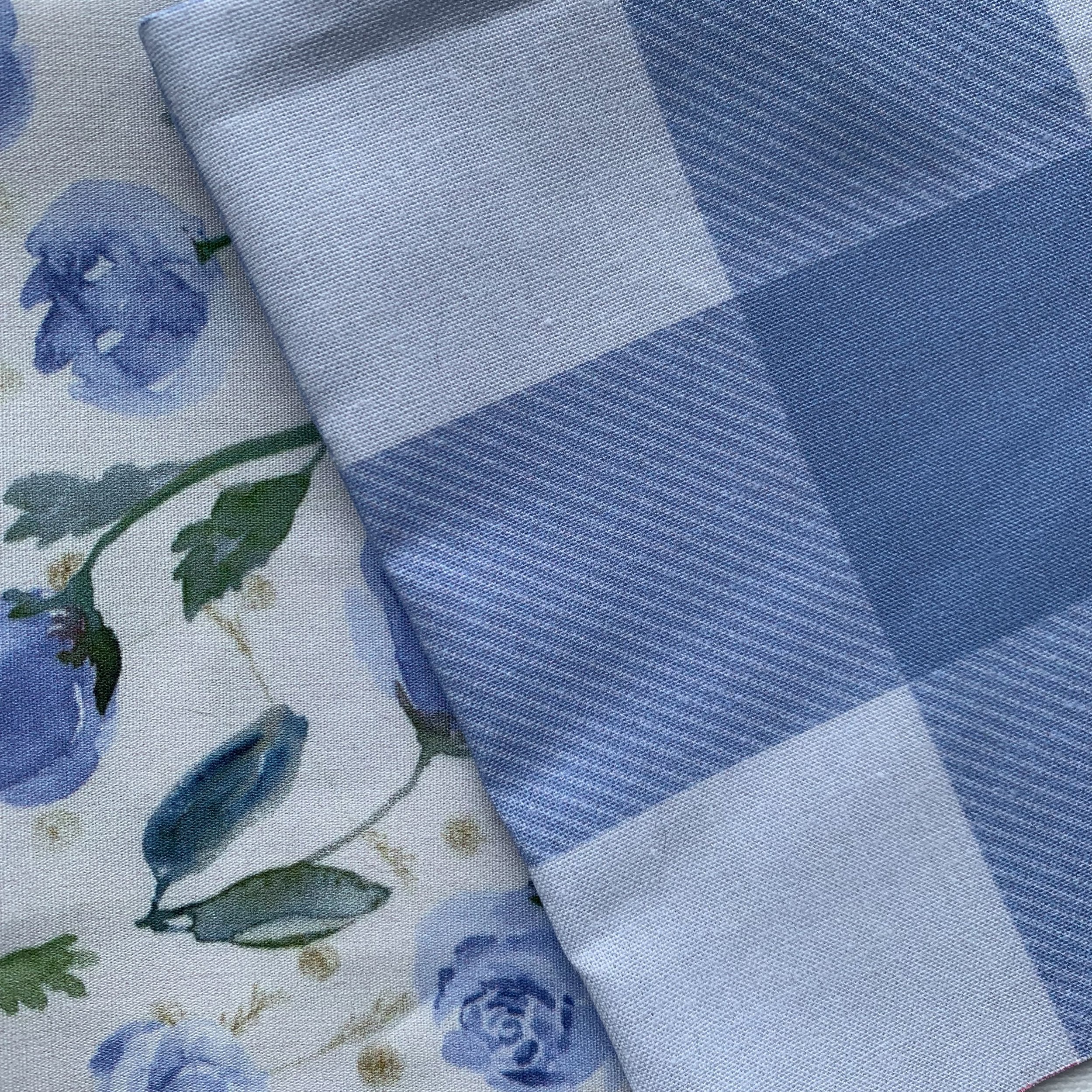
watercolor tossed little roses + gingham check twill
Quick rules for weave texture (save yourself the headache)
DO THIS
Keep texture scale consistent across the collection.
Aim for “reads as fabric” at real scale.
Use weave concepts to blend two colors intentionally.
NOT THAT
Scaling weaves so big they become a competing pattern.
Making the weave texture so tiny it vanishes when printed.
Combining colors that mud together, unless you want that effect.
Want my exact method?
I have a tutorial that walks through creating a plaid with woven texture (and it comes with a PDF of tips).
Find the tutorial here: Create a Plaid Tutorial
And if you want to see how these blenders work in real collections, you can browse my fabric + wallpaper here:
Spoonflower shop: InkandSun