
Fix a Flat Pattern: Add Texture the Right Way
Have you ever finished a pattern and thought: something is just not working?
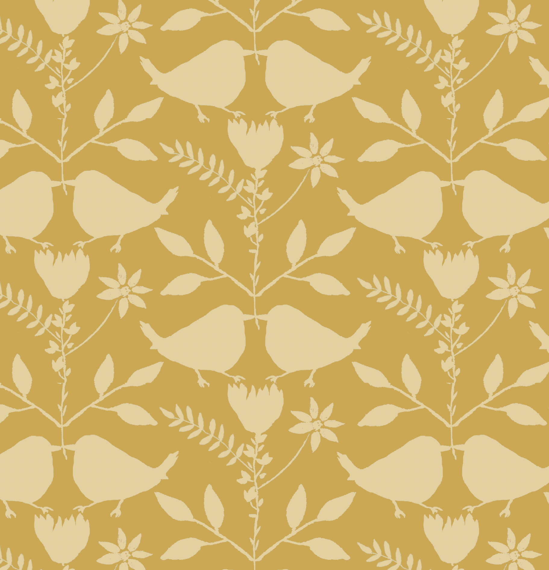
If your motifs are good and your colors are good, but the pattern still looks “off,” there’s a high chance the issue is the ground — not your artwork.
This is the fix I use most often:
The real problem: your ground is separating everything
DO THIS
Look at your pattern and ask: Do my motifs feel connected to the ground?
If they look like they’re floating, you don’t need new motifs.
You need a ground that helps the eye move through the design.
NOT THAT
Moving everything closer
Adding more motifs as “filler”
Changing the color palette. Keep the palette that works for the collection
One simple solution: add quiet texture to the ground or motifs
Texture isn’t just decoration. It’s structure.
A good texture:
reduces the “empty white space problem”
makes motifs feel like they belong in the same world
creates cohesion without stealing attention
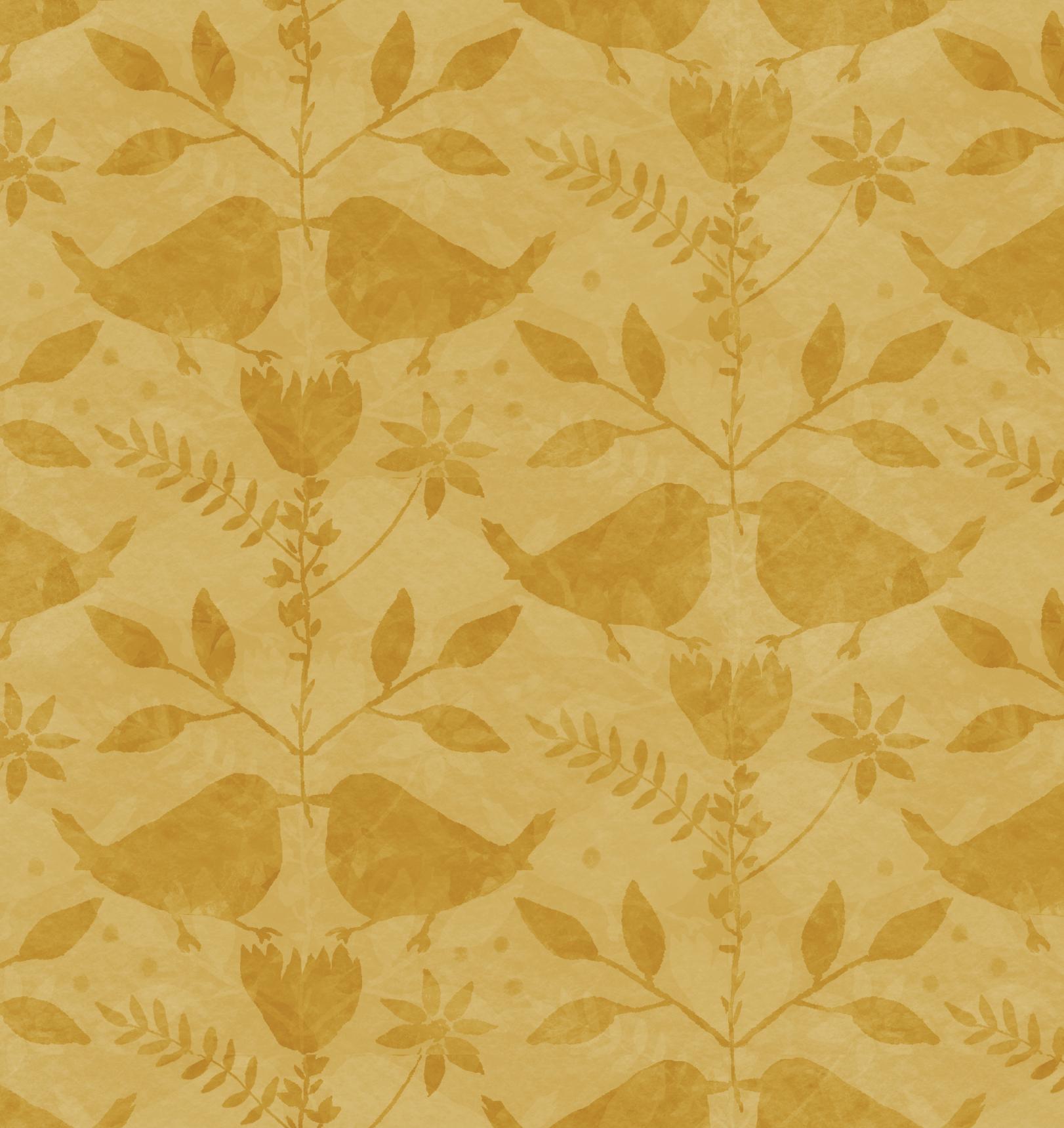
The “Ink + Sun” texture rules (simple + practical)
DO THIS
Keep your texture subtle enough that it reads as texture, not a new pattern.
Use texture to support the main motifs.
Test your texture at end-use scale (not zoomed-in designer scale).
NOT THAT
Scaling textures so large they compete with the motifs.
Adding texture everywhere just to fill space.
Ignoring contrast - too little and it disappears; too much and it becomes noisy.
Check out another example here: Why Texture Matters
Want my quick cheat sheet?
I made a free PDF: 5 Texture Tips - it explains why texture works, when you don’t need it, and what to try first when something feels off.
Download the free PDF here: 5 Texture Tips
If you try this and post your result, tag me so I can cheer you on and share it, @inkandsun_