
From Pattern to Product: What Changes (and What Matters Most)
When designs leave the screen and begin to live in the real world
Over the past few months, I’ve been sharing how I build small, intentional pattern collections, starting with three designs and refining how they work together.
But there’s a moment in the process that changes everything:
When patterns move off the screen and onto a product.
It’s one thing to see a collection as swatches.
It’s another to see those same patterns used in real life.
And that shift often reveals what’s working and what needs to change.
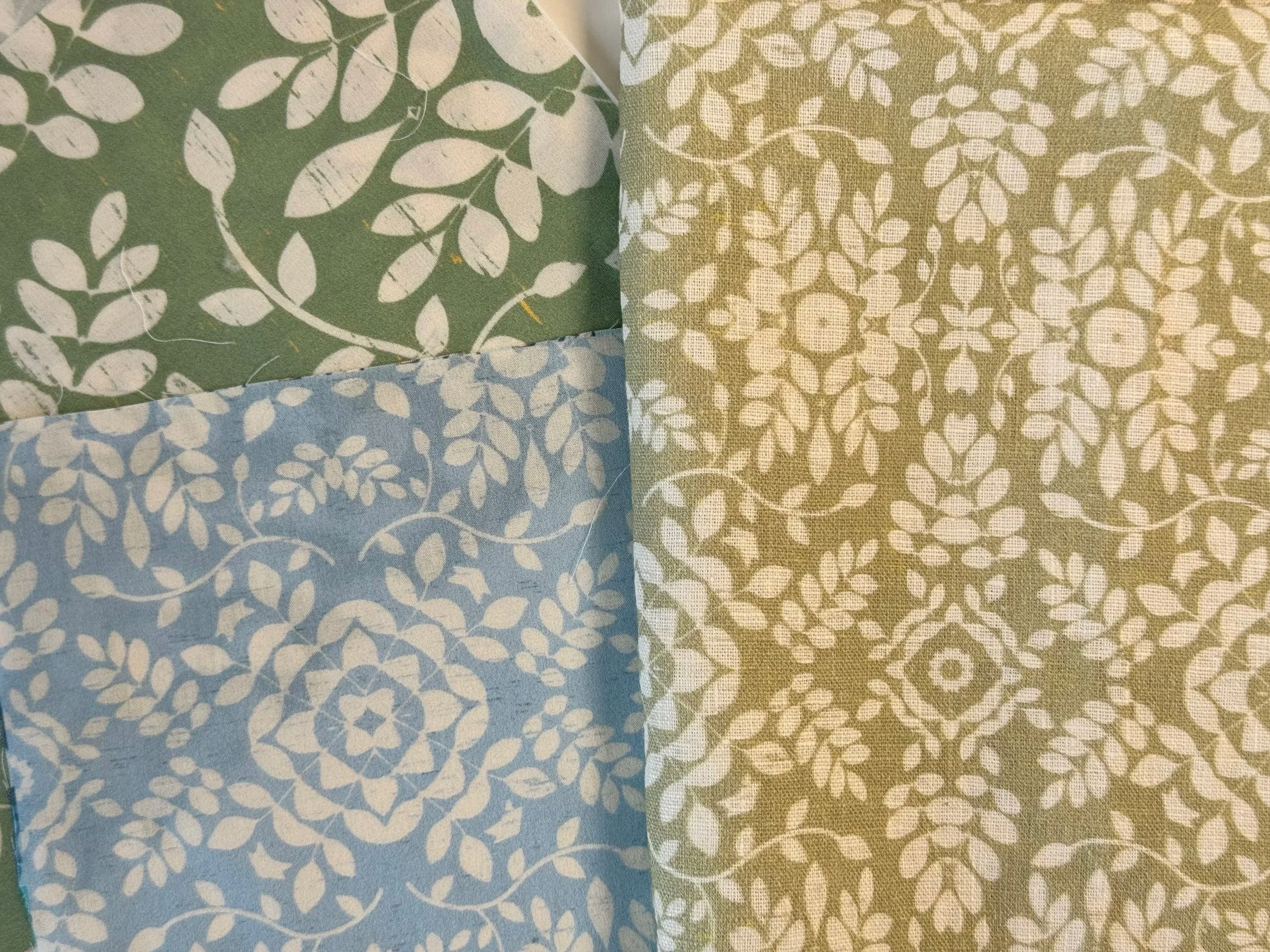
Leaf damask scale shifts
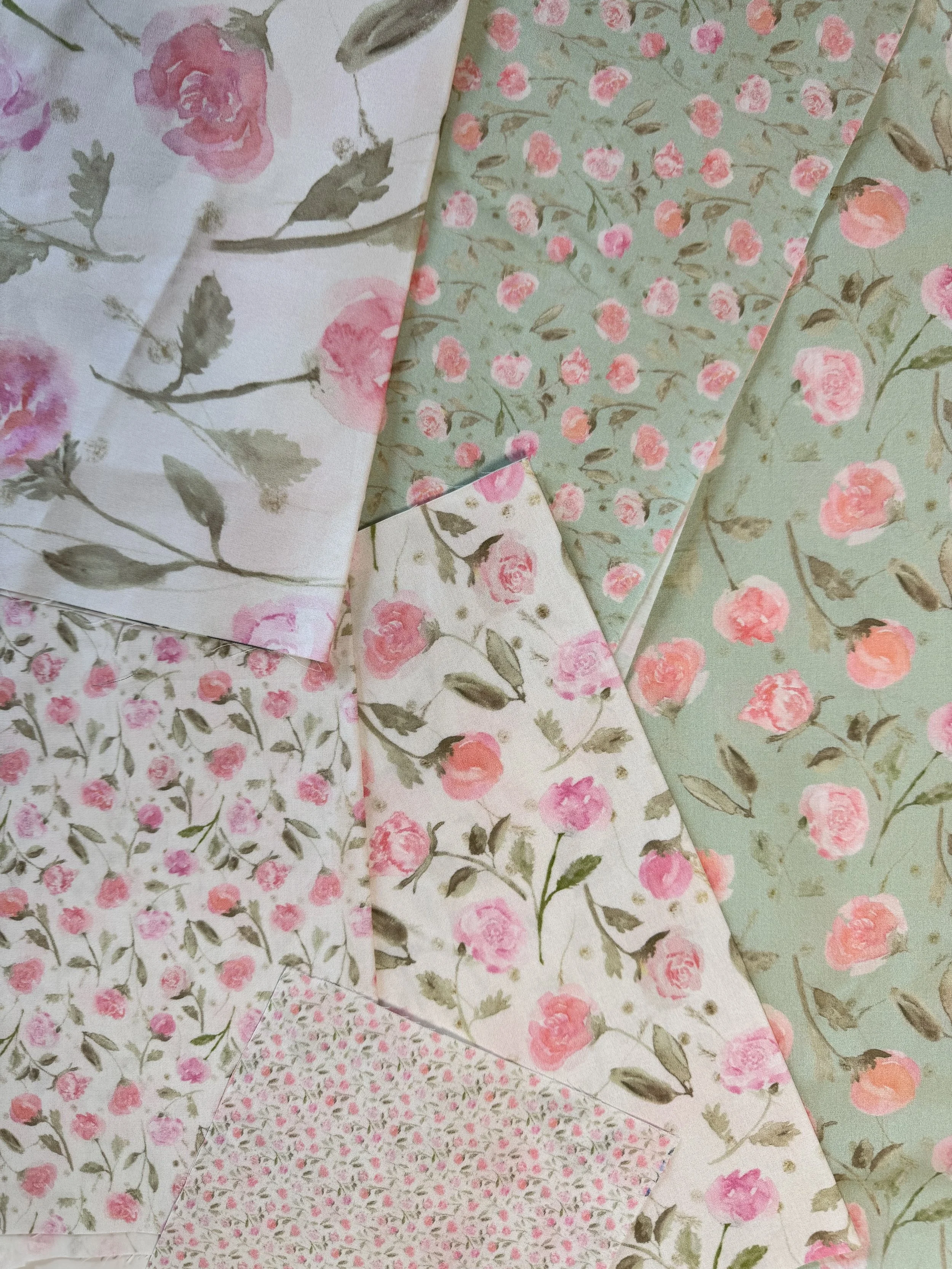
Little Roses in multiple scales
1. Scale Behaves Differently on Products
DO THIS: Adjust scale based on end-use
NOT THAT: Assume your pattern scale translates as-is
A pattern that feels balanced on screen can behave very differently depending on where it’s used.
A large-scale floral might feel:
Too vibrant on a wall
Overwhelming on a napkin
Perfect on bedding
Smaller patterns (blenders) often sell well because they are useful across products. They:
Support larger work
Feel less dominant
Layer more easily
When designing for real use, scale becomes less about preference and more about function.
2. Color Shifts
DO THIS: Let color adjust slightly across products
NOT THAT: Expect identical color in every application
Color rarely behaves the same way once it’s printed.
Lighting, material, and surrounding objects all influence how color is perceived.
Sometimes a palette will shift slightly:
A background softens
A color becomes more prominent
Contrast appears reduced
These adjustments don’t weaken a collection, they make it more livable.
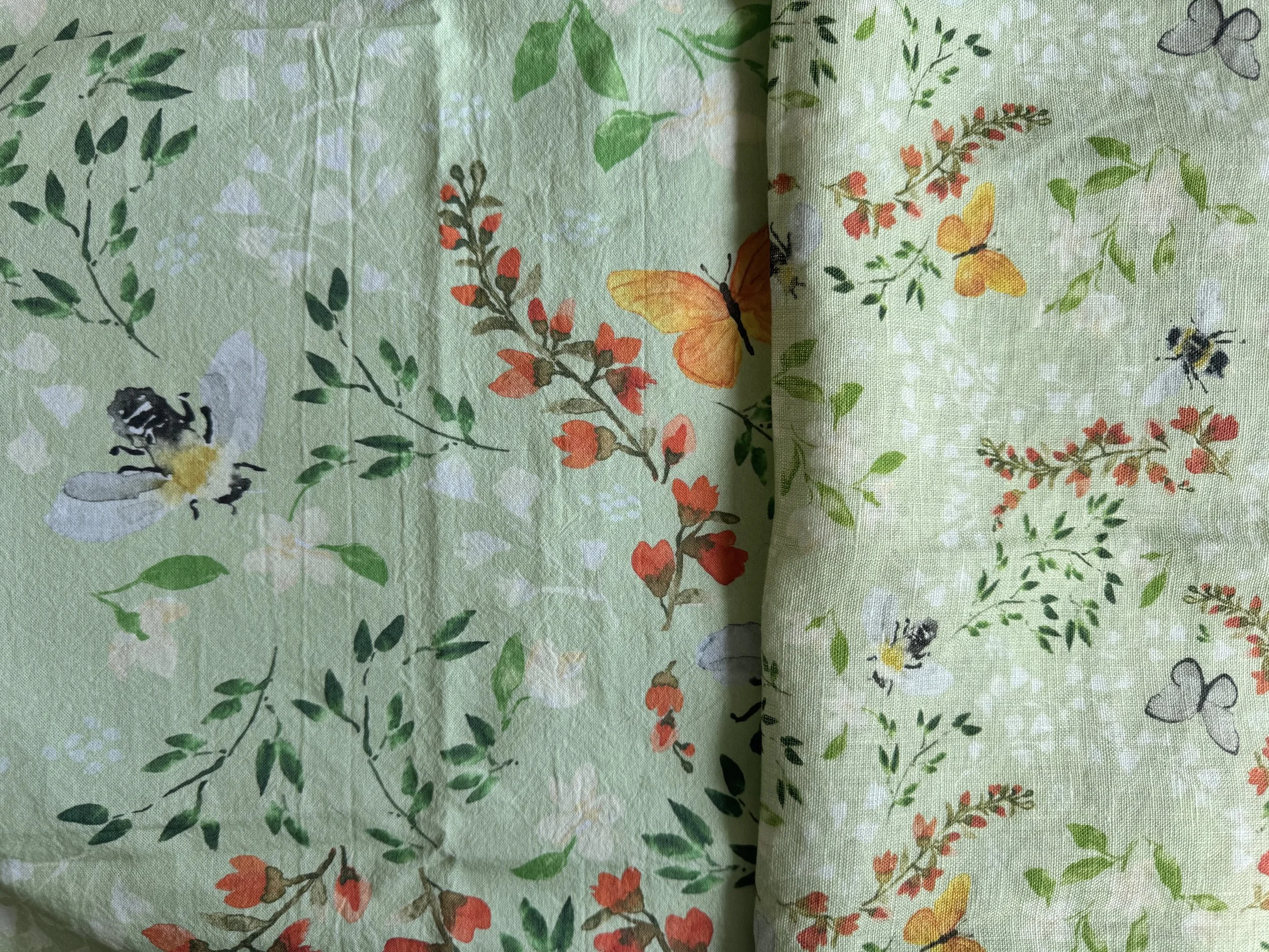
Bee Floral color change on cotton vs linen (with scale change)
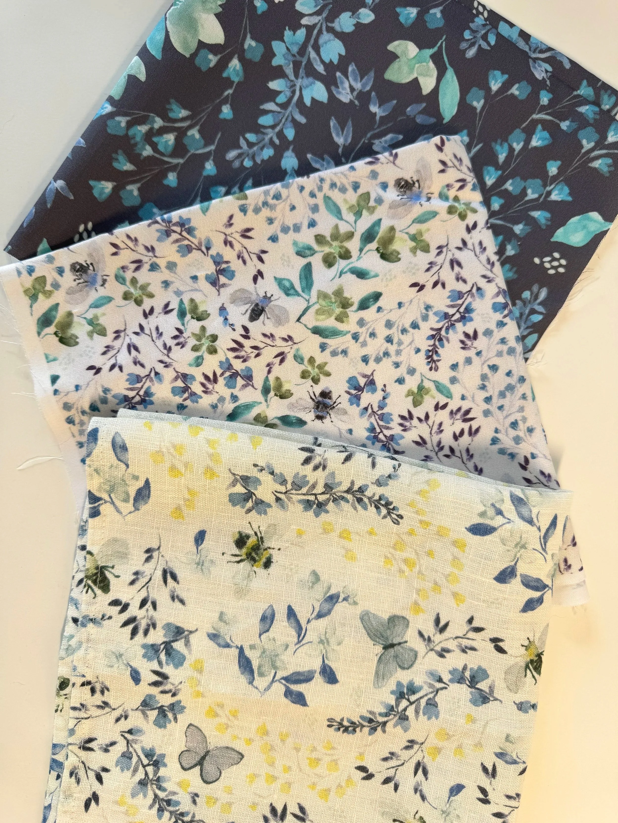
Bee Floral changed in density for napkins
3. Spacing and Density Matter More Than You Expect
DO THIS: Consider how the pattern fills the space
NOT THAT: Focus only on the motif
When patterns are used on products, spacing becomes just as important as the motifs themselves.
A design that feels rich and layered as a swatch can feel:
Too dense on a small product
Too sparse on a large surface
The goal isn’t to make everything evenly filled — it’s to create a rhythm that works for the scale of the product.
4. Products Reveal What Patterns Do Best
This is often the most surprising part.
Once patterns are applied to real objects, their roles become clearer:
Some designs naturally become focal points
Others become the most versatile patterns
Some are best used sparingly
A collection that feels uncertain on screen often becomes clearer when placed into context.
Designing patterns is one skill.
Designing for products is another.
When you begin thinking about:
scale in use
color in context
spacing across surfaces
your collections become easier to develop, present, and ultimately use.
A Simple Next Step
If you’ve been working with small collections, try this:
Order a fabric sample of each in different scales. Spoonflower is a great resource to test your patterns.
Then ask:
Would I really use these together?
That question often reveals where changes in scale, color, and density will improve your work.
Instead of asking:
“Do these patterns look good?”
Try asking:
“Do these patterns work in real life?”