
How to Test Whether Your Collection Is Ready for Product
A simple way to evaluate your designs before expanding a collection
In February, I wrote about why three-piece collections are such a powerful design practice. Working with a hero pattern, a supporting design, and a quieter texture helps designers focus on relationships rather than simply creating more patterns.
But once those three designs are working together, the next question becomes:
Are these patterns ready to become products?
A collection that looks good as swatches doesn’t always translate well into real use. Scale, density, and color balance can behave very differently when patterns are applied to a product.
Before expanding your collection or presenting it to a client, it’s worth running a simple test.
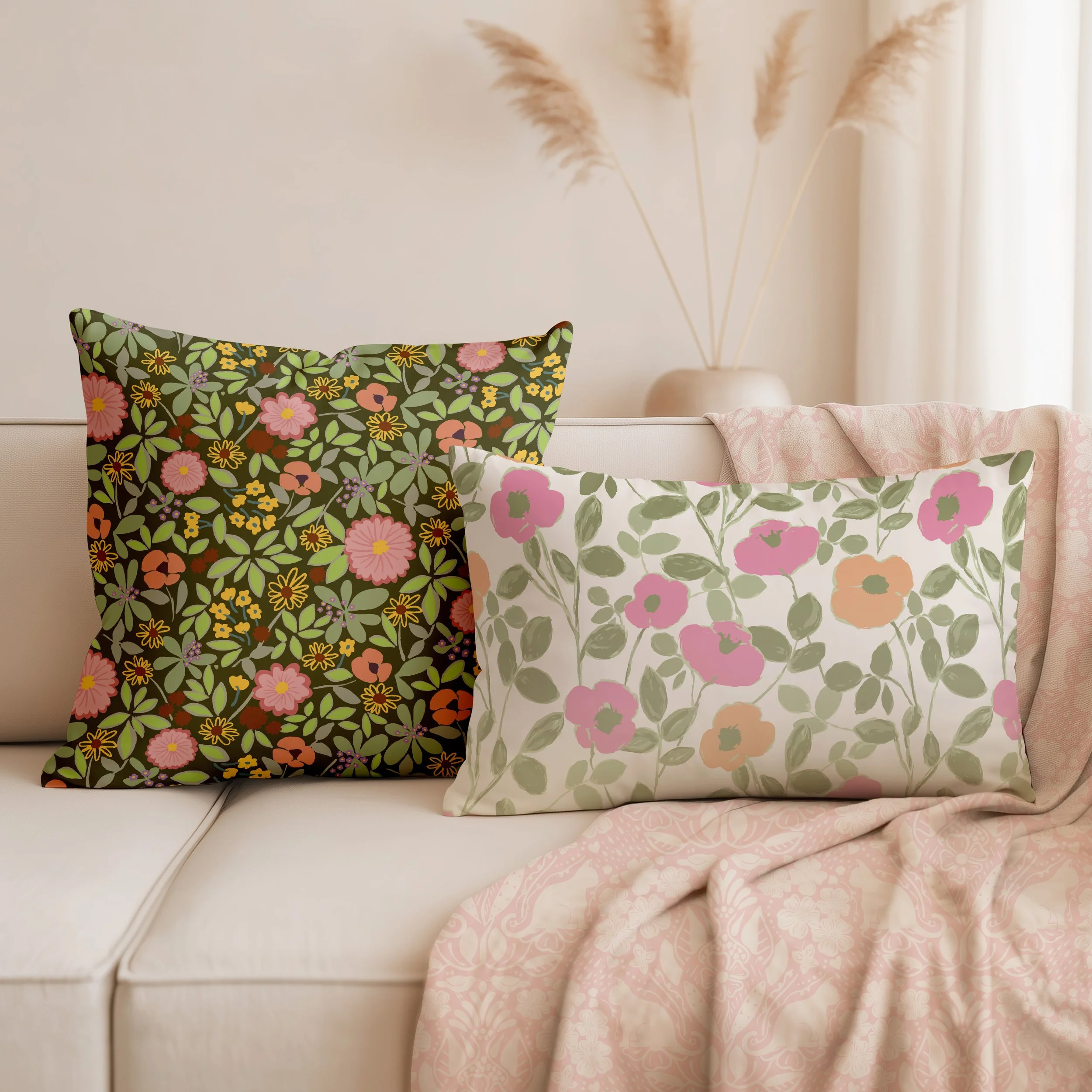
Test #1: Place Your Patterns Into a Real Context
The easiest way to evaluate a collection is to place the patterns into a simple mockup.
Instead of looking at three flat swatches, try placing them in a setting such as:
A room scene
A set of tabletop products
Apparel
A product layout such as pillows, napkins, or stationery
Select a mockup that use at least three patterns. This will help you visualize a mini-collection that works well together.
When patterns move into context, their roles become clearer.
A hero pattern might feel bold and exciting as a swatch but overwhelm a large surface. A supporting pattern may suddenly become the most useful design in the group.
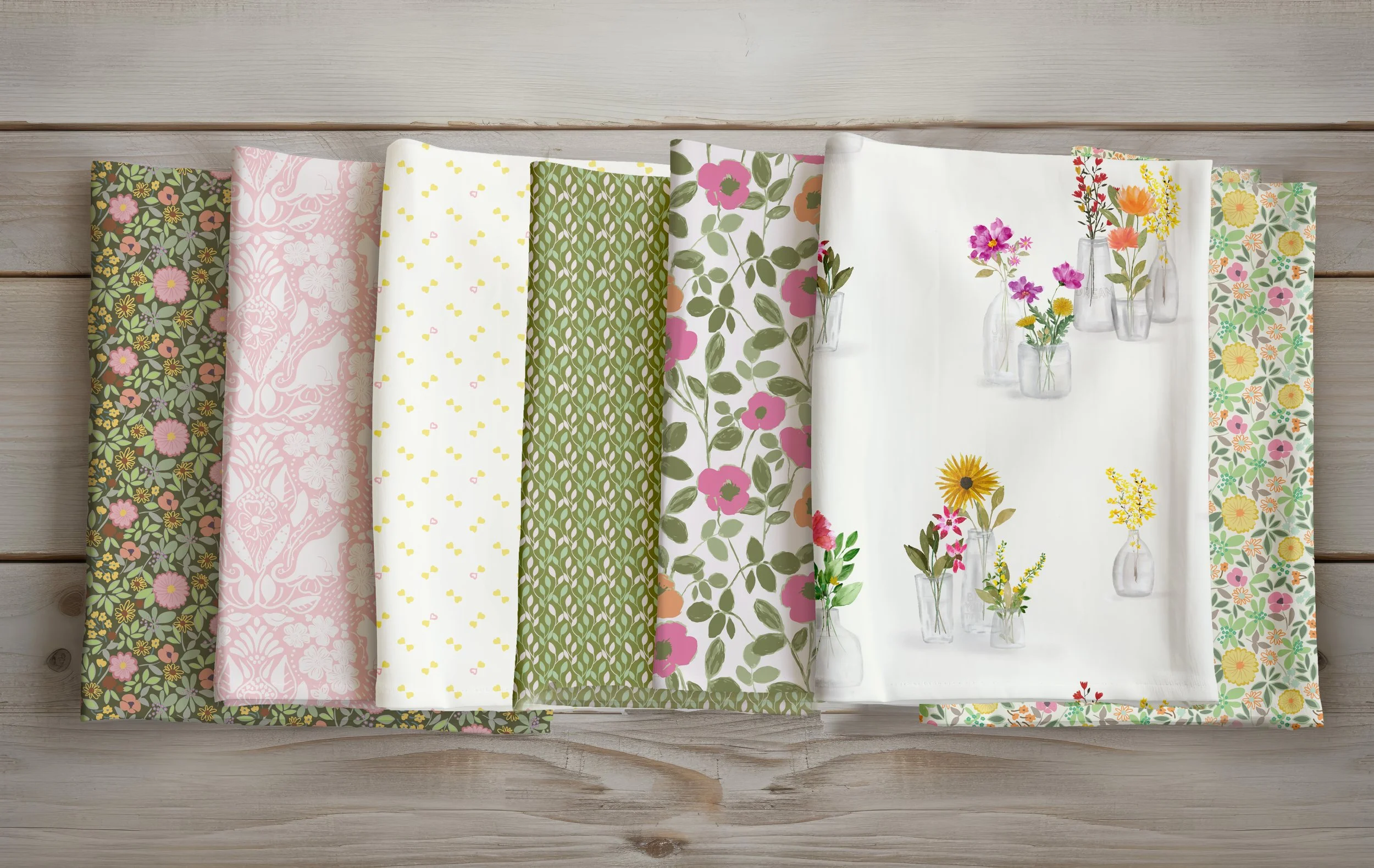
Cat in the Garden, Pepperharrow Floral, Paired Hearts
Wallflowers Collection
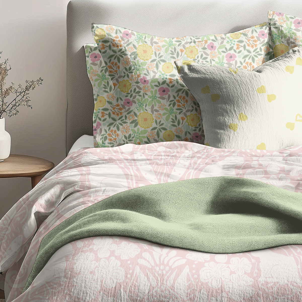
Bedding mock-up made up of a secondary, and two blenders without the hero.
The hero in this collection is fantastic for wallpaper.
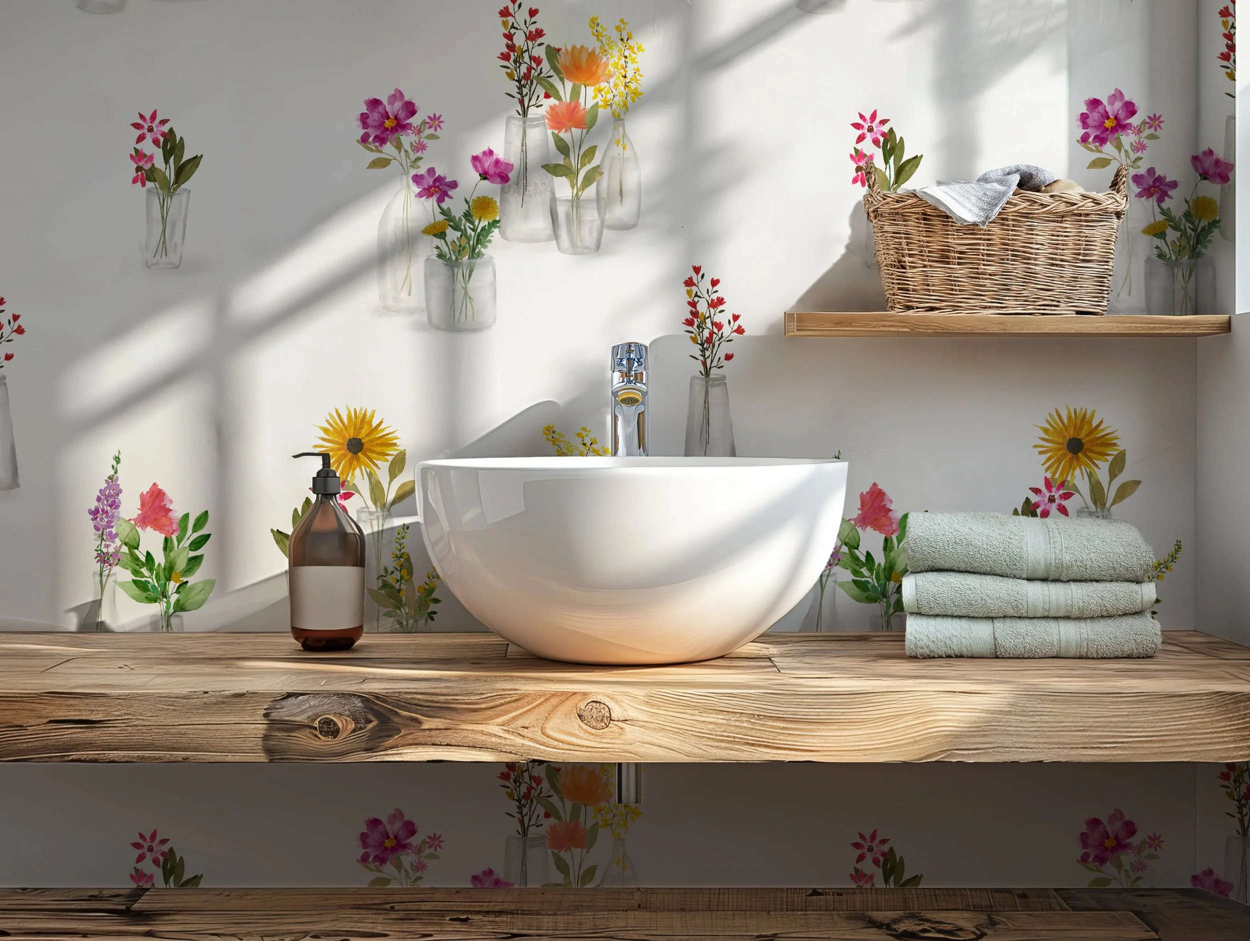
Wildflower Floral
Test #2: Check the Balance of Scale and Density
Strong collections usually include variation in scale and visual weight.
Ask yourself:
Is one pattern clearly larger in scale?
Is one design visually calmer or more open?
Does the collection allow the eye places to rest?
If all three patterns feel equally busy or equally large in scale, they may compete rather than support each other.
This is where mini collections are helpful. With only three designs, you can clearly see how each pattern contributes to the overall rhythm.
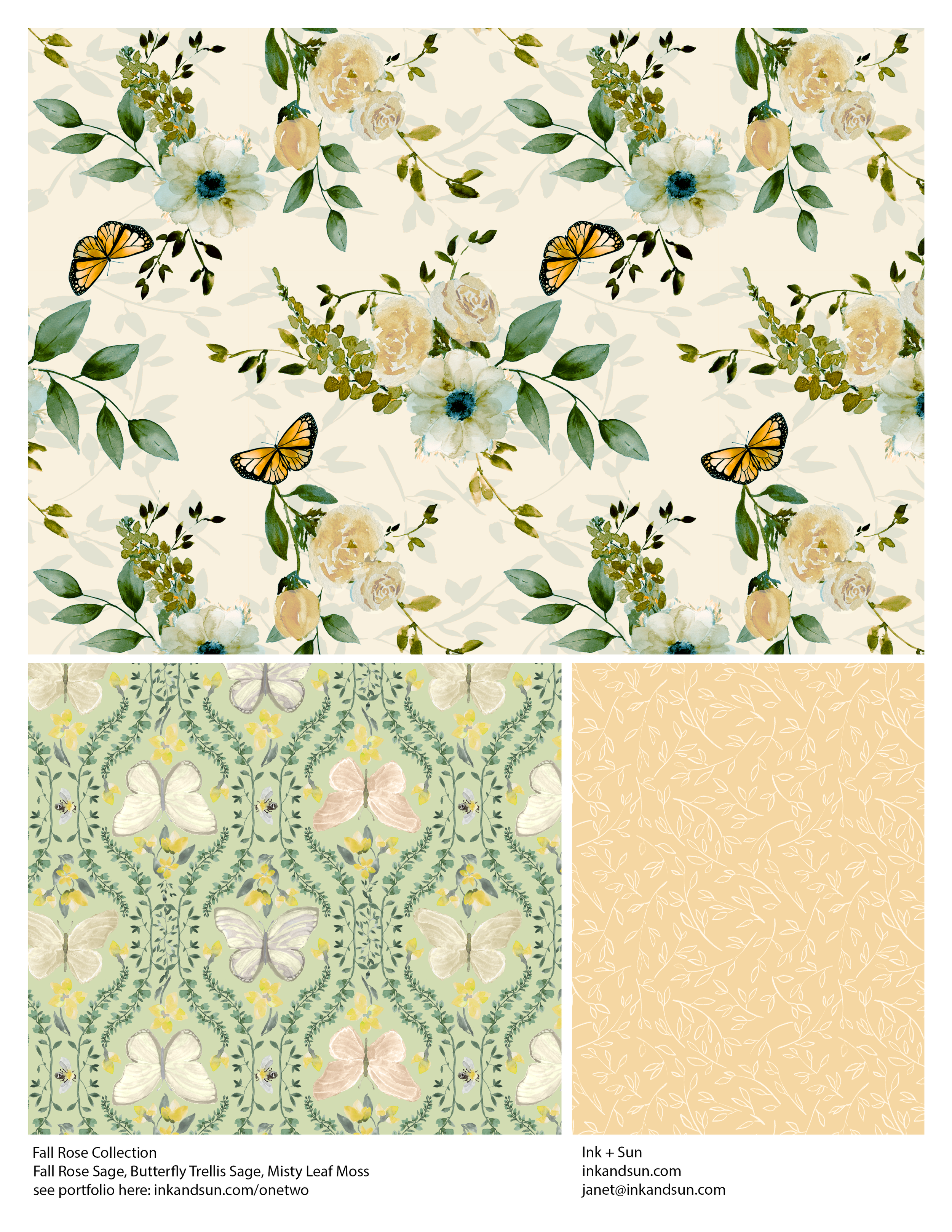
Butterfly Trellis Collection: Spring Rose, Butterfly Trellis, Misty Leaf
Test #3: Evaluate Color in Context
Color often behaves differently once patterns are used together.
A collection may share a palette, but that doesn’t mean every design should use color in the same way.
Instead, look for color variation across the patterns:
One design may lean darker
Another may highlight the lightest tone
A third may emphasize a secondary color
These shifts create depth and flexibility when the collection is applied to products.
If every pattern uses identical color proportions, the result can feel overly matched rather than cohesive.
Image suggestion:
Three patterns sharing a palette but with varied color proportions.
Pepperharrow Floral, Poppies, Cat in the Garden
Adding a dark background to one design creates dynamic variety
What Happens After Three Patterns?
Once a mini-collection is working well in product context, you have a strong foundation.
From there, you might expand by adding:
A stripe or geometric
A simple textural pattern
A coordinating basic
Or another mini-collection that supports the first.
Mini-collections are not limitations. They’re building blocks.
Designers who learn to create strong three-pattern groups often find that larger collections become much easier to manage.
A Practical Way to Experiment
If you’d like to try this process yourself, I’ve included a simple three-pattern template in the February blog post to help you experiment with your own designs.
Sometimes the clearest way to see your work is to place it into context and step back.
Patterns that cooperate on a product usually form the strongest collections.
Closing Thought
Instead of asking:
“What else should I add?”
Try asking:
“Are these designs ready to be used?”
That small shift, from expansion to evaluation, often reveals exactly what a collection needs next.