
Why Three-Piece Collections Are a Powerful Design Practice
And what makes them feel cohesive without matching everything
One of the most common questions I hear from surface pattern designers is some version of:
“How do I make my collections feel more cohesive?”
The surprising answer isn’t “design more patterns.”
It’s design fewer with more intention.
Creating a large collection can not only be intimidating, it can water down your idea, adding styles that in actual use may not make sense together.
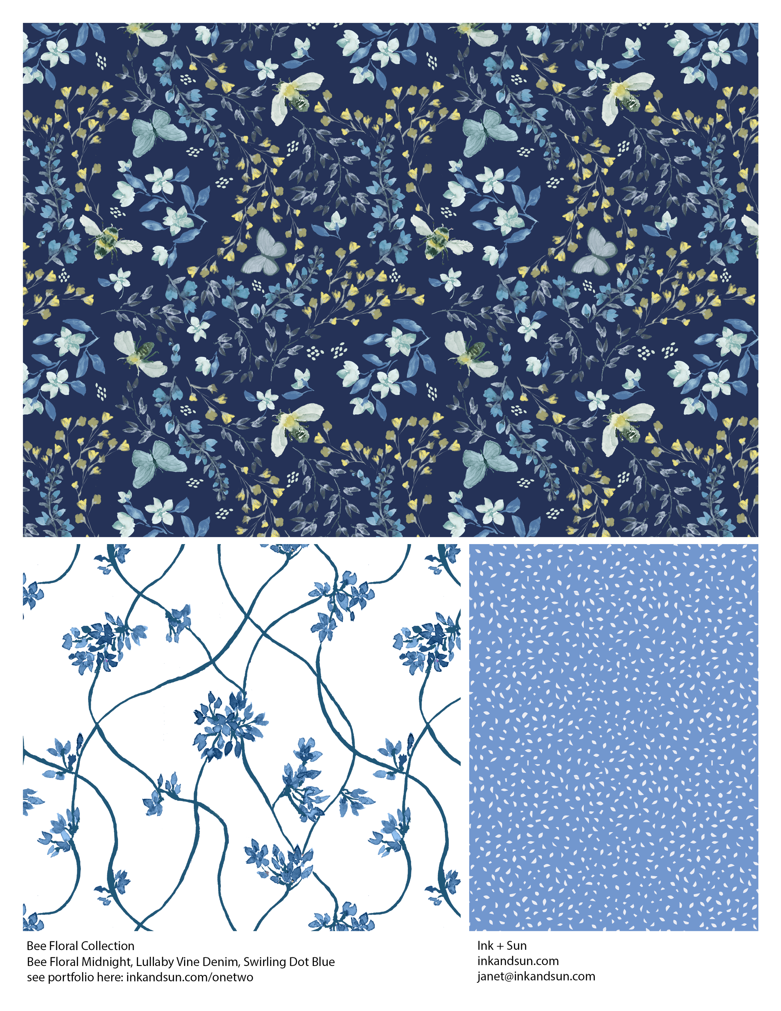
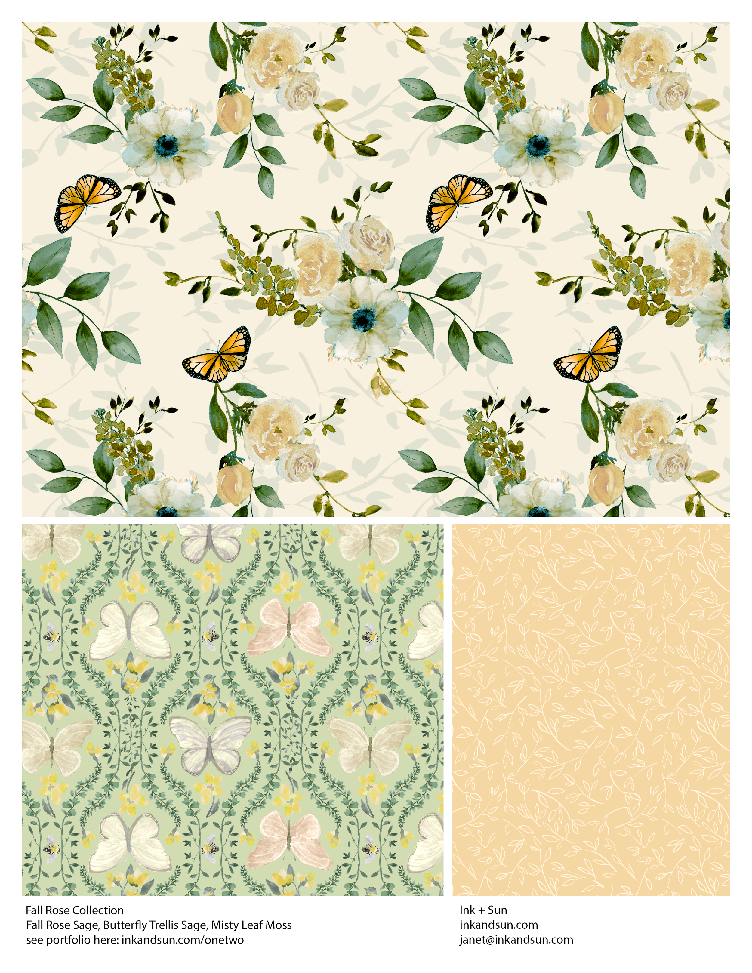
A simple three-piece collection - a main design, a supporting pattern, and a quiet or textural design - is one of the most effective ways to practice cohesion without falling into the trap of matching everything.
It helps you break down your idea into bite-size sections that create a more cohesive whole.
Build Relationships Between Designs
DO THIS: Design in small collections
NOT THAT: Put twelve designs together just to fill the slots
A three-piece collection forces you to think relationally.
Instead of asking, “How do I design a collection of twelve patterns?”
you start asking, “How will my patterns be used together?”
In a strong mini-collection:
One pattern leads
One supports
One creates breathing room
Mini collections can then be combined into larger plans while retaining clear connections.
When you design one pattern at a time, it’s easy to choose the scale and color randomly. When you design in a trio, each piece has a job to do, and that creates clarity.
Eliminate Repeated Motifs
DO THIS: Use related elements
NOT THAT: Copy the same motif in multiple designs
Matching motifs can feel safe. But when the same flower, leaf, or icon appears unchanged in multiple patterns, the collection often feels redundant rather than cohesive.
Cohesion doesn’t come from copying motifs, layouts, or exact color placements. In fact, when everything matches too closely, it’s often a sign that not enough exploration happened early on.
Instead of duplicating:
Draw multiple versions of a motif, from at least three angles.
Shift scale and density
Experiment with varying the movement in your layouts
When layout, scale, and density stay too similar across patterns, the collection elements compete rather than support. Visual variety gives the eye places to move and places to rest.
When you explore variations early, you give yourself flexibility later. Cohesion becomes intentional not accidental.
Avoid Matchy Colors
DO THIS: Decide on a mood
NOT THAT: Make colors identical in every pattern
Shared color is helpful.
But when every pattern uses exactly the same palette the collection can feel predictable.
Cohesion doesn’t come from duplication. It comes from mood.
A strong mini-collection might:
Share two anchor colors
Shift proportions from pattern to pattern
Introduce subtle contrast and accent colors for interest
Consistency of feeling matters more than exact color placement.
When colors shift between patterns, the collection gains interest and usability.
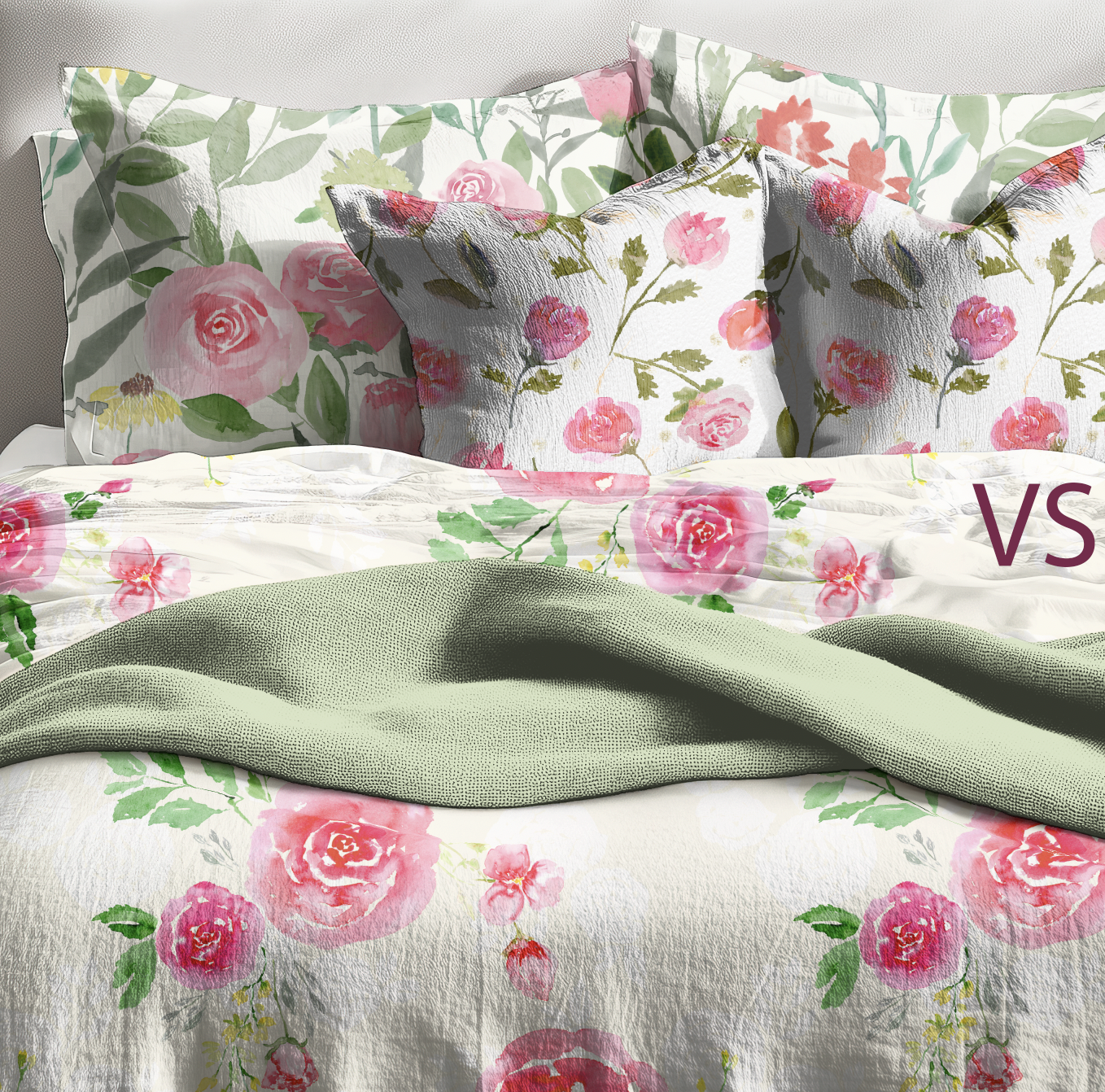
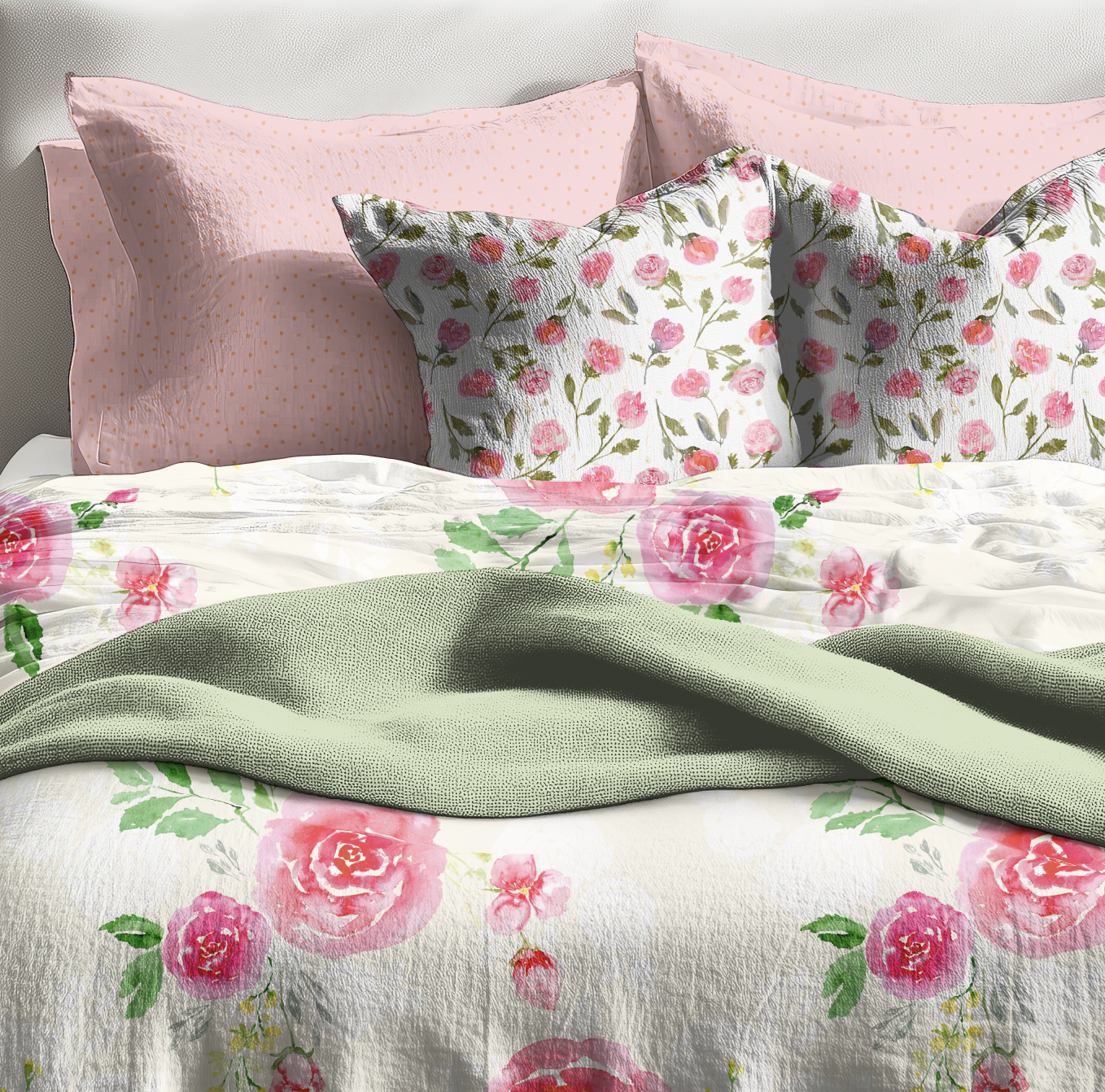
A Simple Test
Place three patterns together in a mockup.
Do they:
Compete?
Repeat too literally?
Or make a varied, dynamic combination?
Instead of asking:
“What else should I add?”
Ask:
“Can these patterns be used together?”
The shift from adding to refining is where cohesion takes hold.
Why this matters
Designing in three-piece collections helps you:
Think more clearly
Stretch yourself to use less duplication
Create finished work that is easy for clients to develop into products
Need a push?
For now, if your collections feels scattered or unresolved, try going smaller not bigger. Sometimes three is exactly the right number.
I’m including a download of a mini-collection template for you to experiment with. There’s one for Photoshop and one for Illustrator. It’s set up to add your pattern swatches in seconds. Having trouble just working with three designs? The download includes a 4-pattern template, as well. Use the fourth design to add a stripe or basic.
Want to explore this way of thinking a little more?
I’ve created a simple mini-collection checklist to help you evaluate:
Design relationships
Motif variety
Color balance
It’s a practical tool you can use whenever a collection starts to feel crowded or uncertain.
→ I’ll be sharing it soon with my email list. Join Now!