
How I Build Color Palettes That Work (and Why Inspiration Isn’t Enough)
Color inspiration is everywhere. Turning that inspiration into a palette that actually works across products and patterns is where things can break down.
Common Assumption
If colors look good together in a photo, they’ll work as a palette.
Why That Breaks Down
Photos contain more colors than usable palettes
Lighting distorts value
Emotional reaction does not equal a functional palette
Do This / Not That
Do this:
Reduce inspiration to 4–6 working colors, then refine the palette for usability
Identify dominant, secondary, and accent roles. Vary the amount of each color used, think 60-30-10
Check value contrast in grayscale - critical step often skipped!
Test palettes across more than one pattern
Not that:
Lifting colors directly from a photo without editing
Using the same color choices in every design of a collection
Building palettes without testing how they are affected by scale and repetition
Case Studies
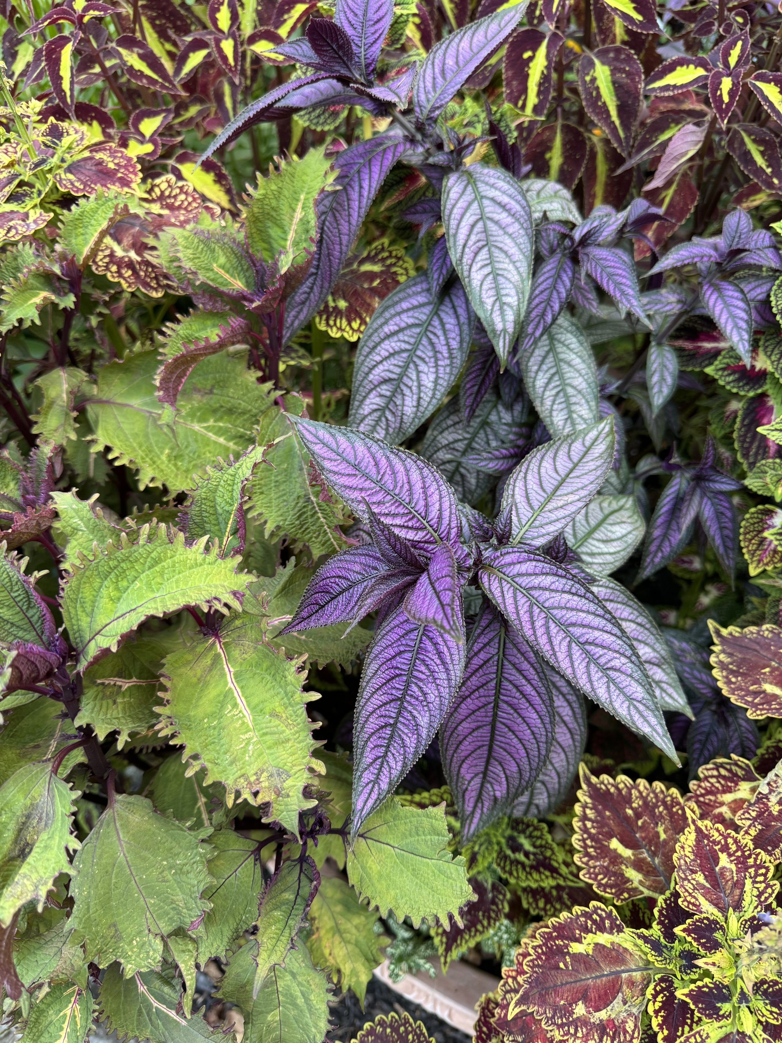
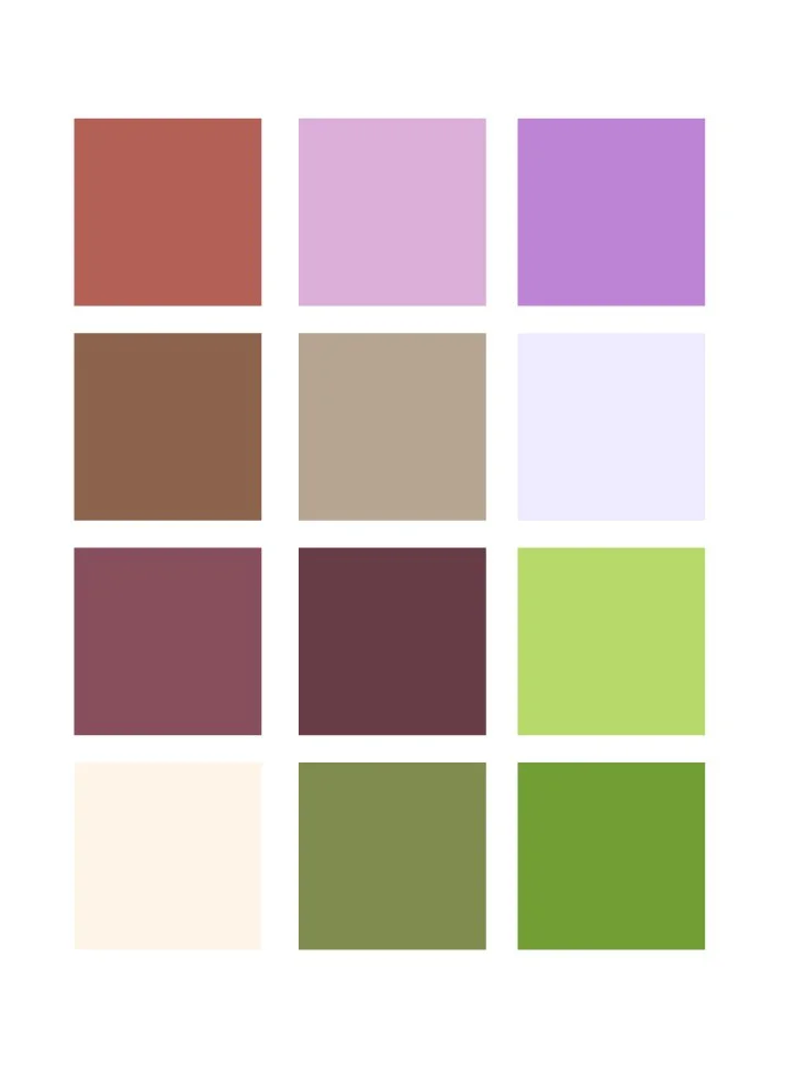
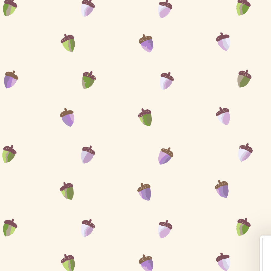
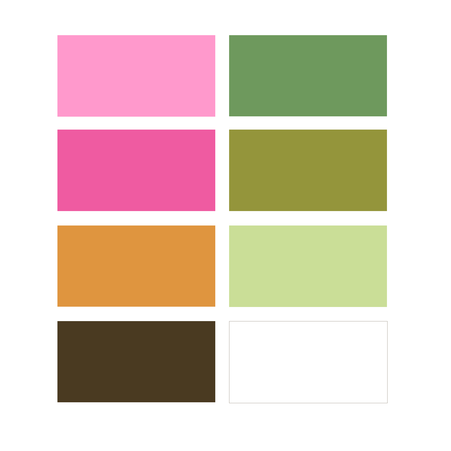
Coleus Fall Palette
sometimes your inspiration will have hundreds of shades and tones. It’s up to you to choose the top 4-6 most important hues
Add nuetrals! Combine warm and cool tones for a balanced effect
A great palette has light, medium, and dark values, along with 2-3 saturated and 2-3 unsaturated.


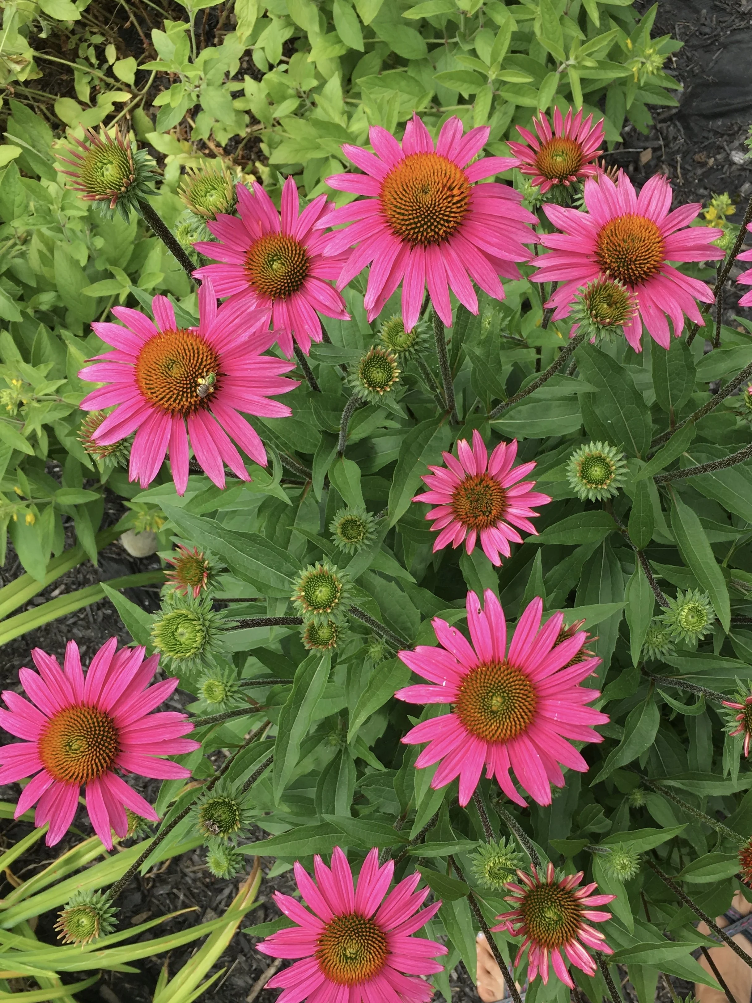
Echinacea Palette
Sometimes your inspiration will highlight two complementary colors. Balance them with colored neutrals that lean toward one main color
Include a range of values while maintaining the complementary structure
Even a small, tight palette needs variety in saturation and contrast


Winter Neutrals Palette
Sometimes your inspiration will be neutral, color them by following a standard color theme: complementary, analogous, etc
To avoid a flat result, vary the lightness and darkness of the neutrals
Undertone is critical for balance. Mixing undertones can make everything muddy.


Why Palettes Matters
for pattern collections: use the 60-30-10 rule. This gives the user a main color to focus on
for products: color sells and great color combinations will drive attention to your designs before the patterns will
for visual longevity: Keep your colors defined by identifying contrast, variety, and balance in your palettes